MOBILE APP • PRODUCT DESIGN • Prototyping
Redesigning a fragmented, manual loan flow into a fully automated, end-to-end self-serve experience — improving trust, reducing drop-off, and tightening repayment security.
Lead Product Designer
4 Weeks — Q4 2025
Figma • Miro • Coda • Microsoft Clarity
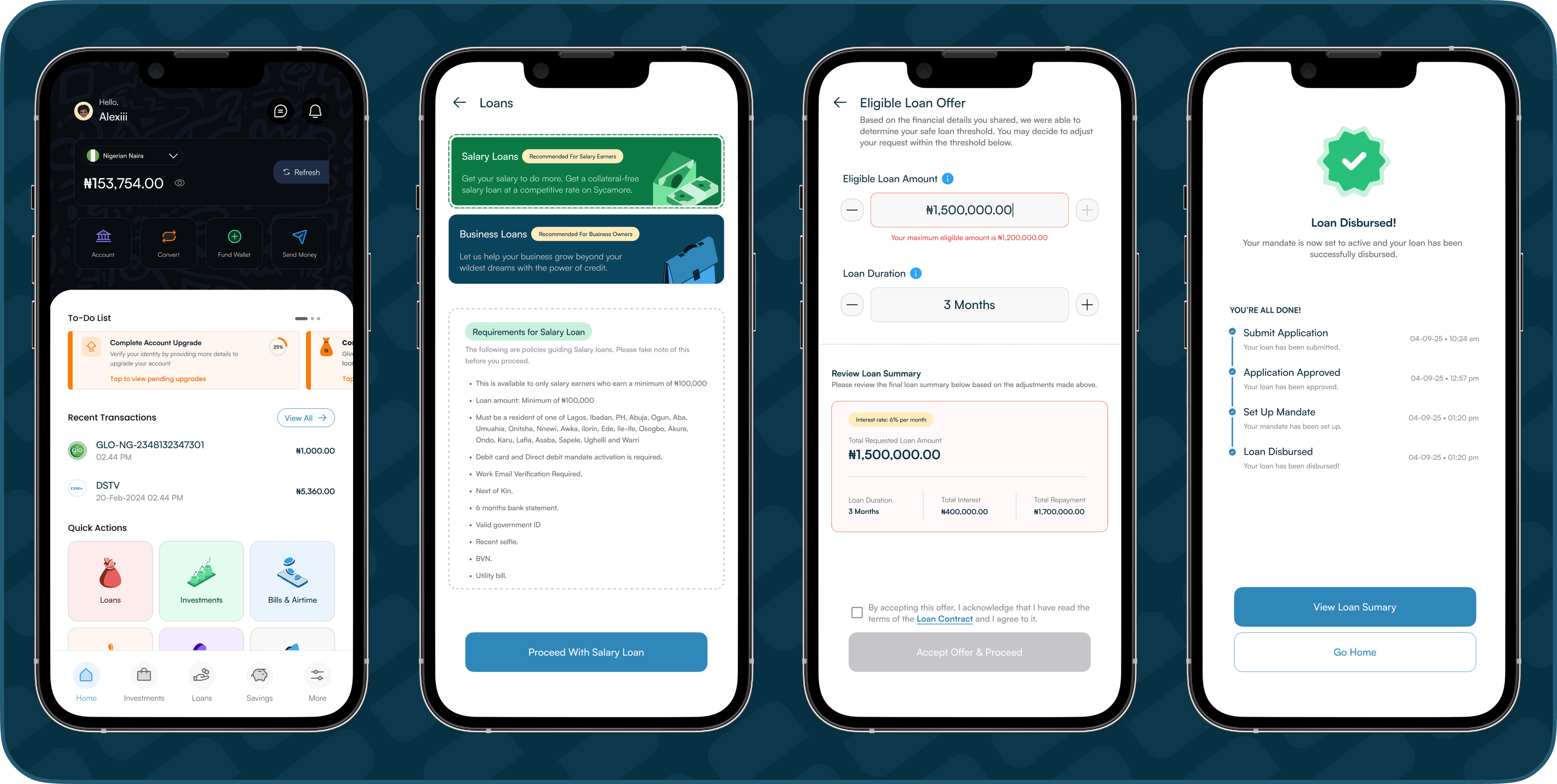
Sycamore is a digital finance platform offering loans, savings, investments, and other financial services to users across Nigeria. The loan application flow was functional but deeply fragmented — users couldn't complete the journey fully within the app. After several steps, applications required manual follow-up from a Sycamore representative, creating friction and uncertainty for users while adding operational bottlenecks for the business. At the same time, weak repayment security was driving higher default risk and excess manual verification work.
Interactive prototype walkthrough
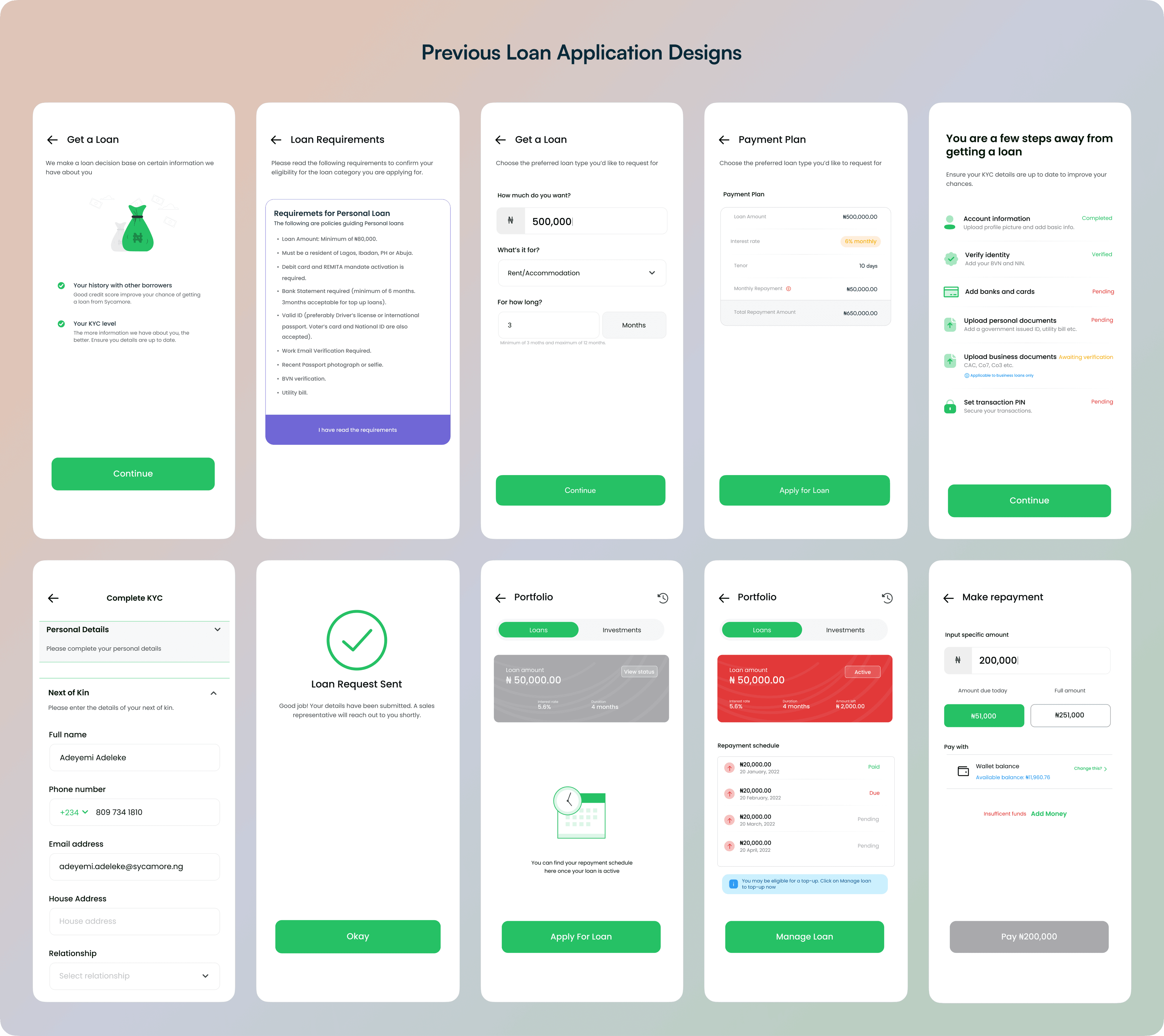
Users were dropping off at three critical points: the eligibility check, the document upload step, and the final review screen. Interviews revealed confusion around 'what happens next' and anxiety about whether they were eligible for the amount they were requesting. The existing design provided no progress indication, and offered no reassurance throughout.
- Loan applications were not fully automated — they required human follow-up to complete
- Multi-step identity verification was confusing and error-prone for users
- No progress indicators — approval timelines felt unpredictable
- Loan terms and repayment expectations were unclear, leading to anxiety and drop-off
- Ops teams handled excessive manual follow-ups that could have been resolved in-app
- Repayment security was weak, contributing to higher default risk
The brief was both a UX and a systems challenge. Success meant delivering a better user experience and a more defensible business model — simultaneously.
- Design a fully automated flow that requires little to no manual follow-ups
- Decrease application completion time to 30 minutes from 15 minutes
- Reduce loan approval time to 6 hours (from 3 days) for amounts under 30 million and 24 hours for those over
- Cut defaults on repayments by 60%
We ran a week's discovery sprint before touching any design files. This grounded every decision in observed behaviour rather than assumption.
- Session replay analysis (Microsoft Clarity) to identify exact drop-off points
- Support ticket review to understand users' confusion
- 6 contextual user tests & interviews
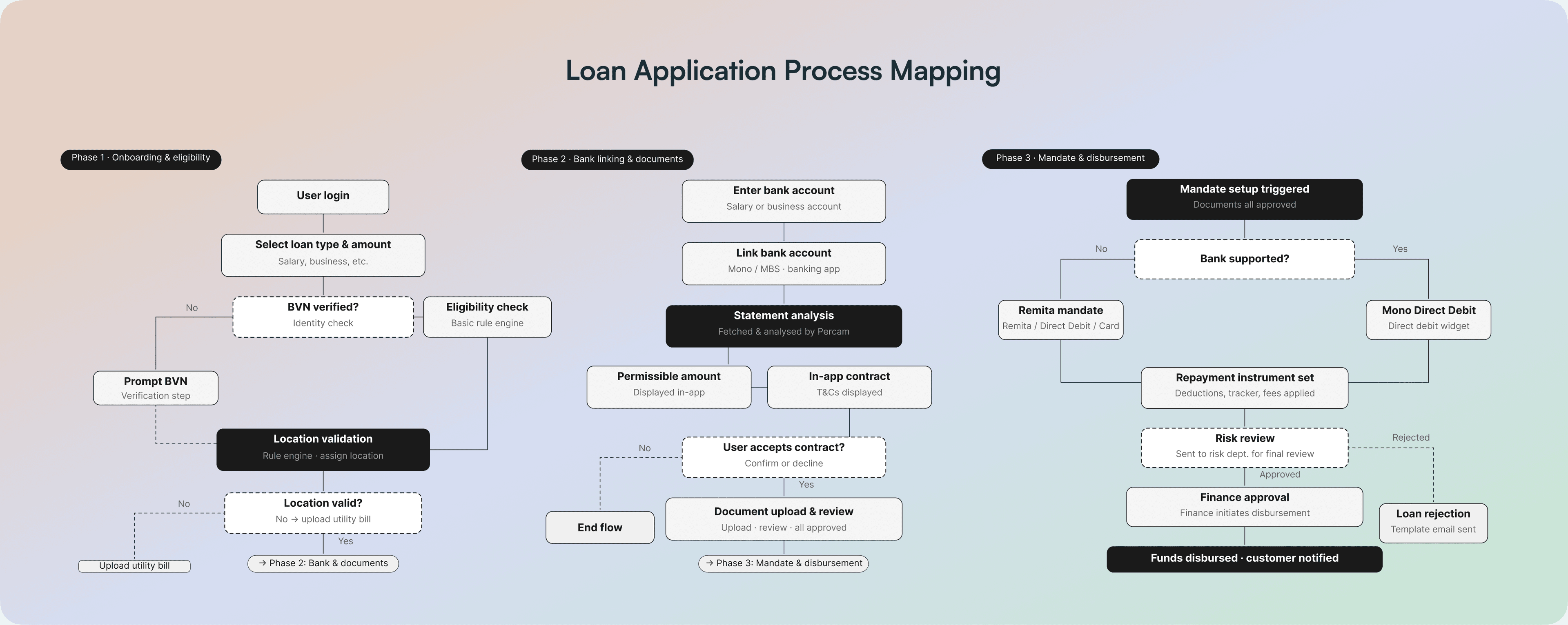
- End-to-end journey mapping including internal ops steps, not just user actions
- Competitive analysis: Cowrywise, Carbon, FairMoney, Kuda
- Collaborated with product, engineering, & risk teams to redefine verification & approval logic
- 3 rounds of prototype testing after designs — before implementation
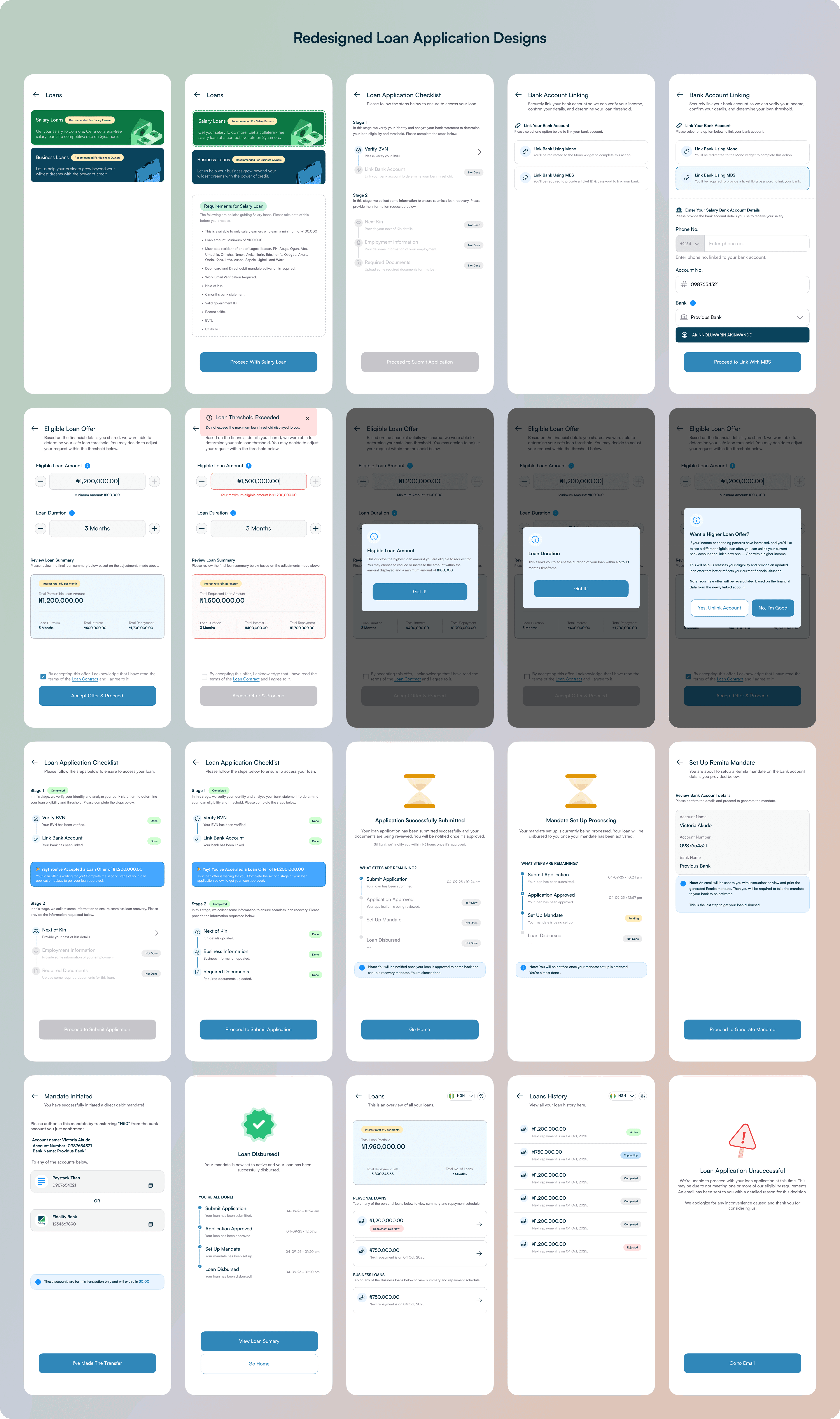
Three decisions had the biggest structural impact on both the user experience and business outcomes.
- Progressive disclosure — broke requirements into stages so users only saw what they needed at each step
- Real-time eligibility checks surfaced early, so users knew their status before investing further effort
- Automated bank mandate integrated directly into the flow to secure repayments upfront
- Contextual tooltips added at high-error fields to reduce form abandonment
After shipping the redesign in September 2025, we tracked metrics over 8 weeks:
- +$9.7M
- Disbursed Loan Amount
- 5 HRS
- Avg. Loan Approval Time
- -34%
- Drop-off Reduction
- +22%
- Repeat Applications
- +40.05%
- Feature Adoption Rate
Fintech UX is fundamentally about trust, not just clarity. Every screen is a micro-negotiation between the user's financial anxiety and the product's reliability.
This project reinforced a principle I return to often: simplifying a flow doesn't always mean reducing rigour — it means designing it more intentionally. The bank mandate could easily have felt like friction, but framed correctly it became a trust signal. Complexity managed well becomes clarity for the user. I also learned to treat ops workflows as a design input, not an afterthought. The most impactful changes came from understanding where business processes broke down, not just where users did.
Next Project