FINTECH • SYSTEM DESIGN • STYLE GUIDE
Building a unified design language from scratch to align product, engineering, and marketing — cutting iteration time by 40% and enabling consistent, trustworthy financial experiences at scale.
Product Designer
2024 — Continuously Growing
Figma
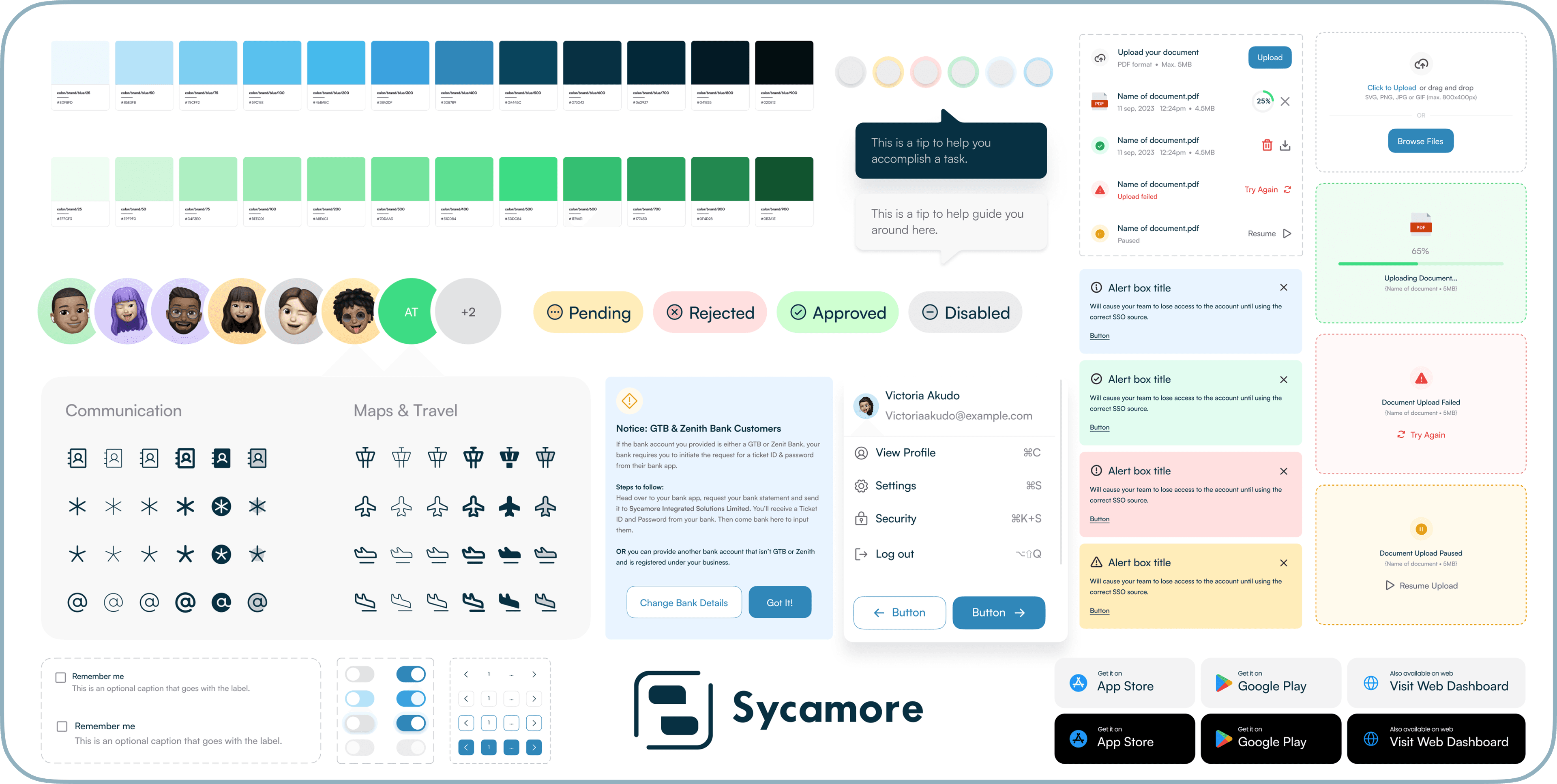
As Sycamore scaled its digital financial products across web and mobile, design inconsistencies and duplicated effort began to slow delivery. The product experience also needed to align more closely with Sycamore's brand and marketing identity across touch points. A unified design system was needed — one that could support scale, consistency, and cross-team collaboration without becoming a documentation exercise that nobody used.
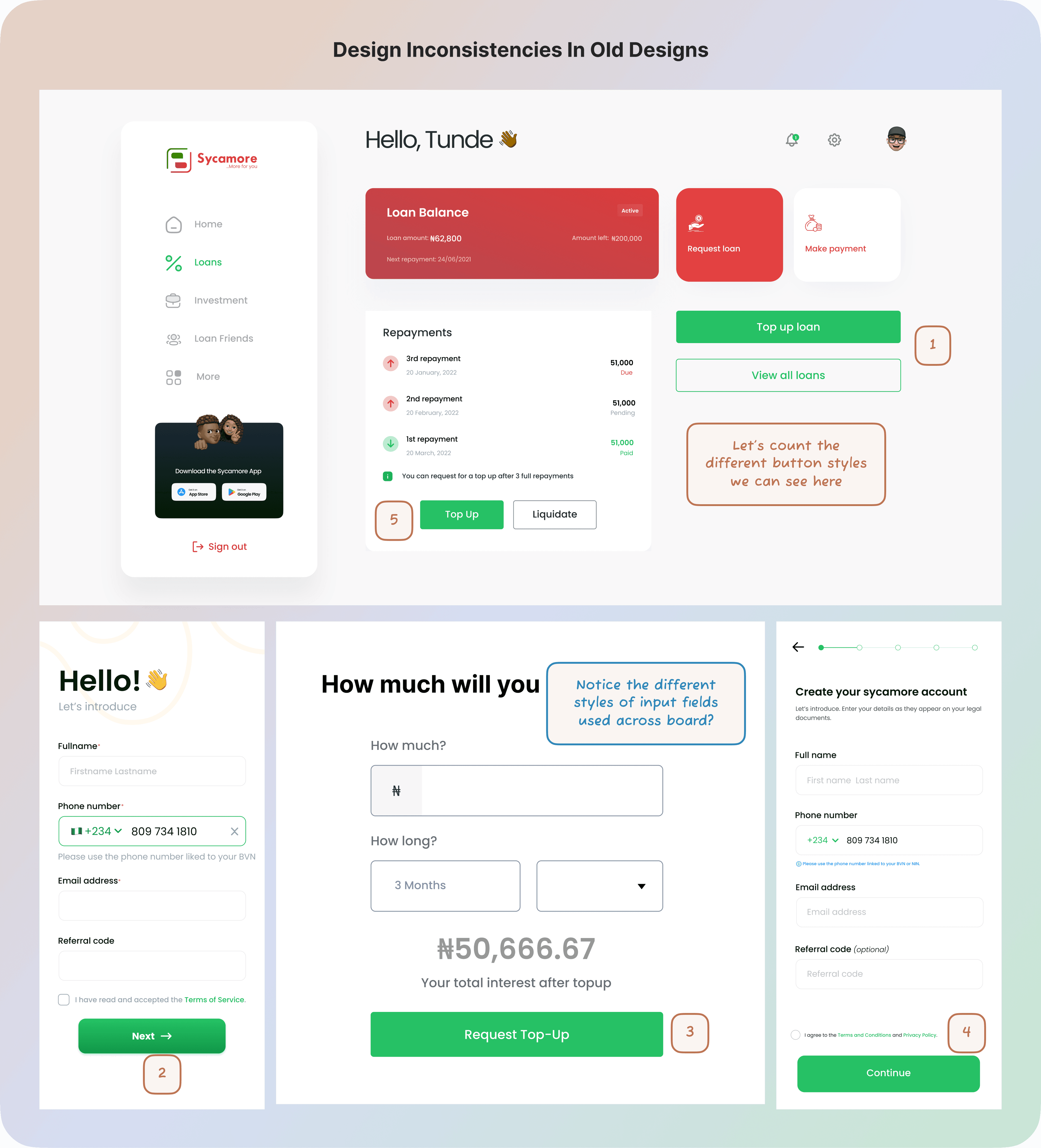
Design inconsistency was accumulating on every team. It showed up in delivery speed, engineering overhead, and user trust.
- UI patterns lacked consistency across product flows — the same interaction behaved differently in different contexts
- Visual inconsistencies emerged between product and marketing surfaces, weakening brand coherence
- Engineering spent excess time clarifying design intent during handoff
- Scaling new features increased the risk of design drift across the product suite
The system needed to serve multiple teams while remaining practical enough that it would actually be used in the day-to-day. Good documentation that nobody opens isn't a design system — it's a design archive.
- Unify product and brand expression across all Sycamore digital products
- Reduce design-to-engineering handoff time and clarification cycles
- Create a system built for real workflows — not theoretical best practice
- Enable consistent, trustworthy financial experiences as the product suite grows
The system was built collaboratively across product design, engineering, marketing, and brand teams. Brand foundations — colour, typography, visual tone — were aligned with Sycamore's existing identity. Product components were then built from the ground up to support real workflows. The focus throughout was on clarity, reusability, and immediate applicability.
- Aligned colour, typography, and visual tone with Sycamore's existing brand identity
- Built product components from scratch — grounded in actual UI patterns in production
- Collaborated with engineering to ensure direct adoption through an internal component library
- Defined clear variants and usage rules for every component
- Kept documentation practical and tied to real examples — not abstract guidelines
Three decisions had the biggest structural impact on both the user experience and business outcomes.
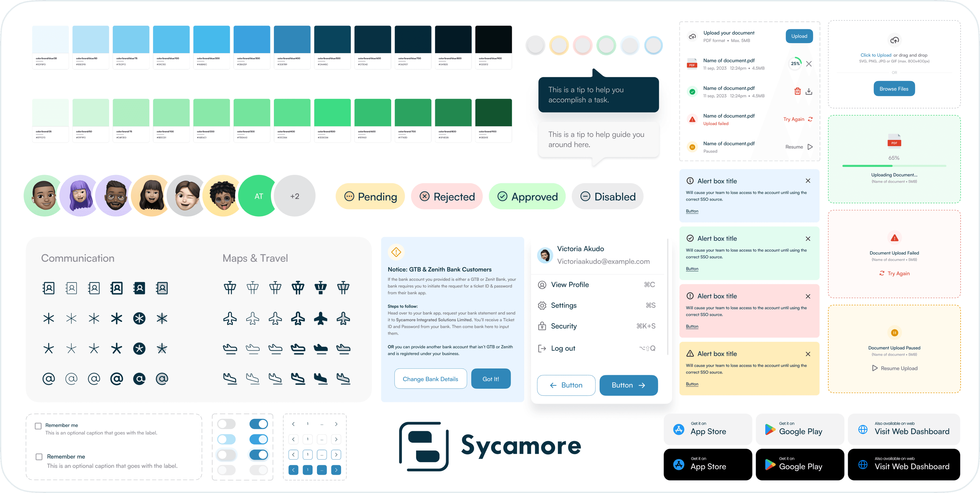
- Foundation tokens: colour, typography, spacing, and elevation
- Layout system and responsive grid patterns
- Interactive components: buttons, input fields, modals, navigation, data display patterns
- Components with full state coverage (default, focus, error, success, disabled)
- Consistent adoption across all Sycamore web and mobile product surfaces
The system became the foundation for ongoing product development and iteration across Sycamore's suite.
- 40% reduction in design iteration time
- Faster design-to-engineering handoff with fewer clarification cycles
- Improved visual consistency across product and marketing surfaces
- Stronger collaboration between design, engineering, and marketing teams
In fintech, consistency builds trust. Every button that behaves differently, every shade of blue that doesn't quite match — these register as subtle signals of unreliability to users managing their money. This system gave Sycamore the infrastructure to scale without that drift. The biggest lesson: build for adoption first. A design system that teams actually use daily is worth infinitely more than a comprehensive one that just lives in a Figma file.
Next Project