WEB APP • SAAS DESIGN
Redesigning a complex, outdated traffic management dashboard into an intuitive command interface for city officials — making real-time congestion control feel approachable, not overwhelming.
Product Designer
6 Weeks — Q1 2024
Figma • Notion
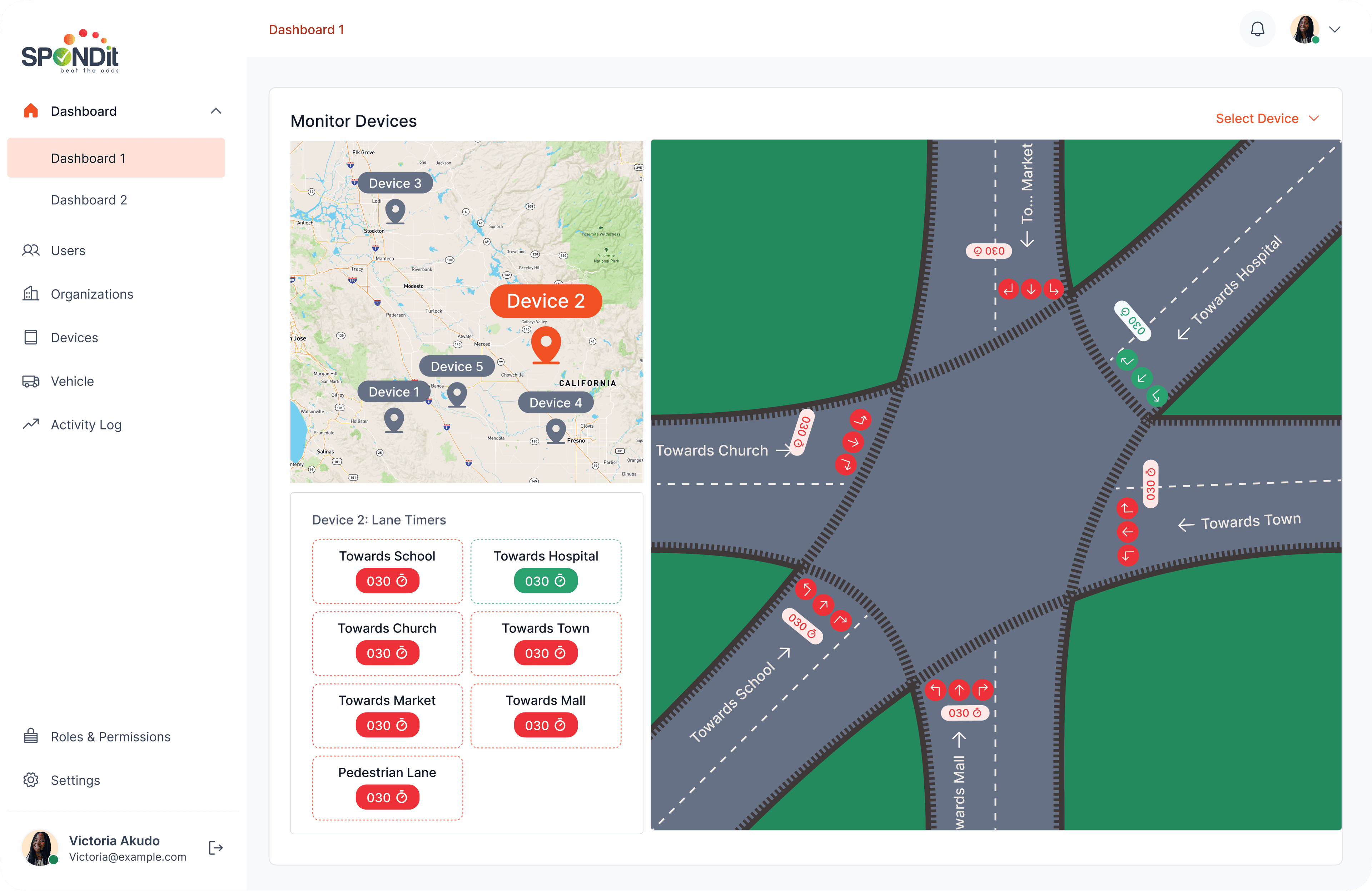
Spondit is a Smart Traffic Management System web application designed to provide an organised, integrated approach to minimising congestion and improving safety in city streets through connected technology. I was brought in to redesign an existing web application that was outdated and not user-friendly — transforming it into an interface that city officials and traffic organisations could actually use under pressure.
The existing system was built for function, not for the humans operating it. The UI was extremely outdated and the experience in general was not intuitive at all. City officials managing live traffic — often under stress, across long shifts — needed a tool that reduced cognitive load, not increased it.
- Outdated UI with poor visual hierarchy made critical information hard to scan quickly
- The interface wasn't designed for the high-stakes, time-sensitive nature of traffic management
- Inconsistent interaction patterns slowed operators down at moments that required speed
- No clear priority system for alerts — everything appeared equally urgent
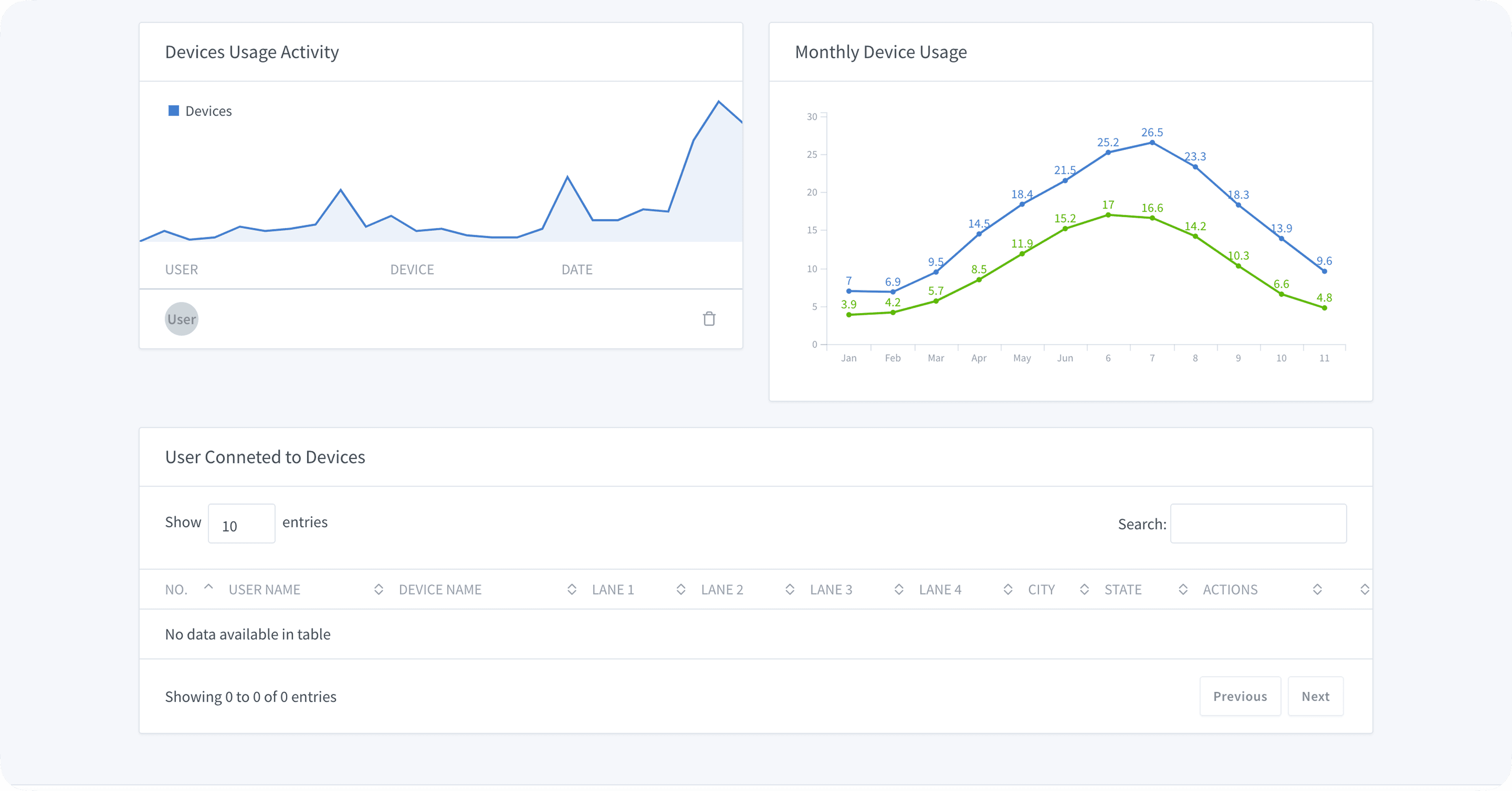
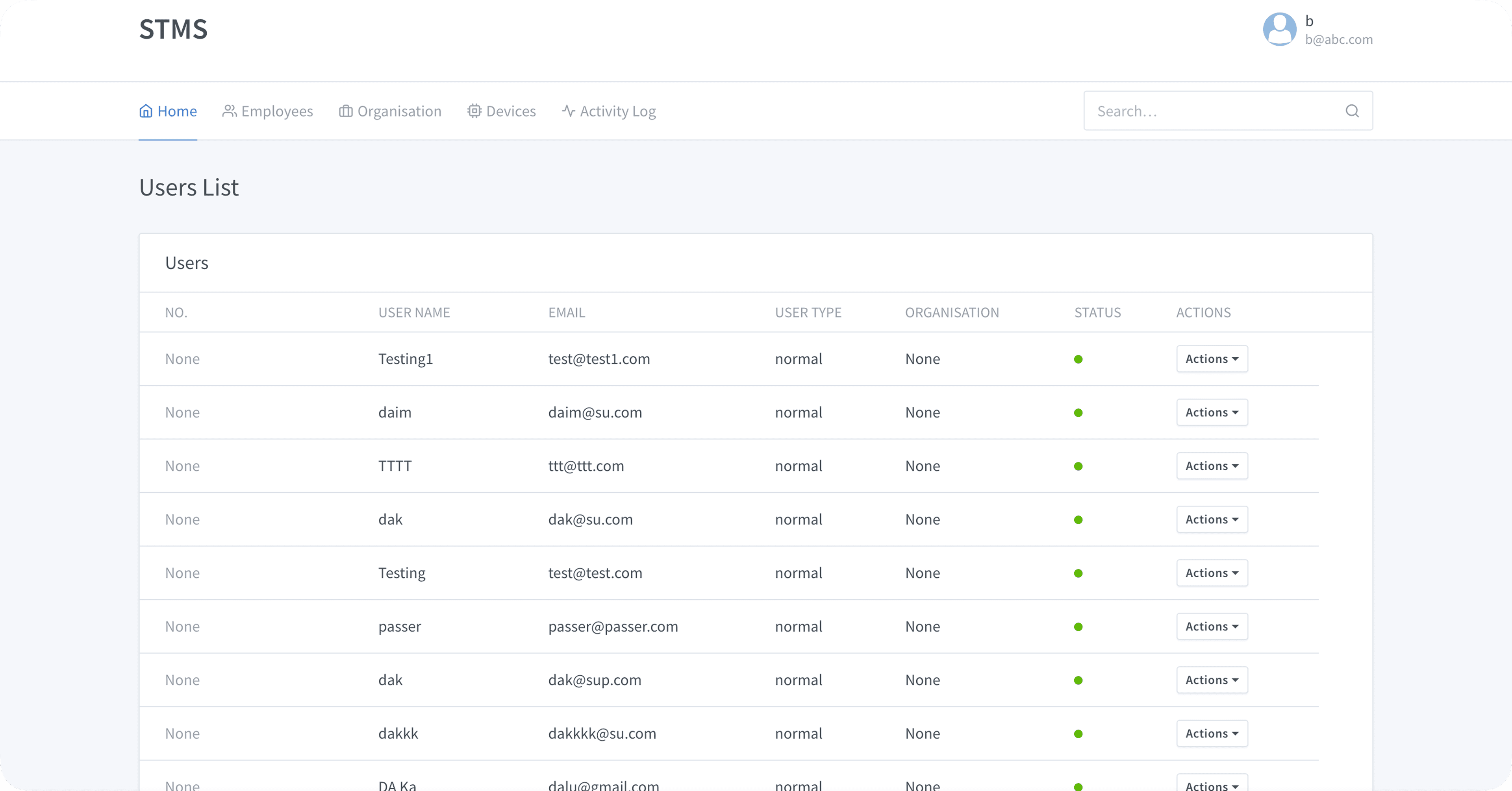
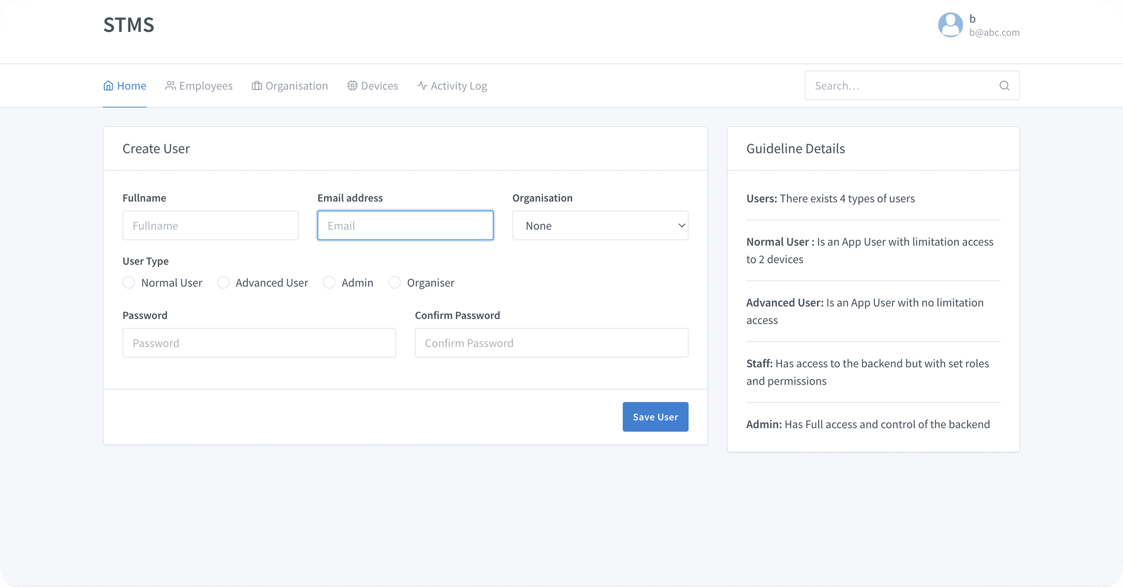
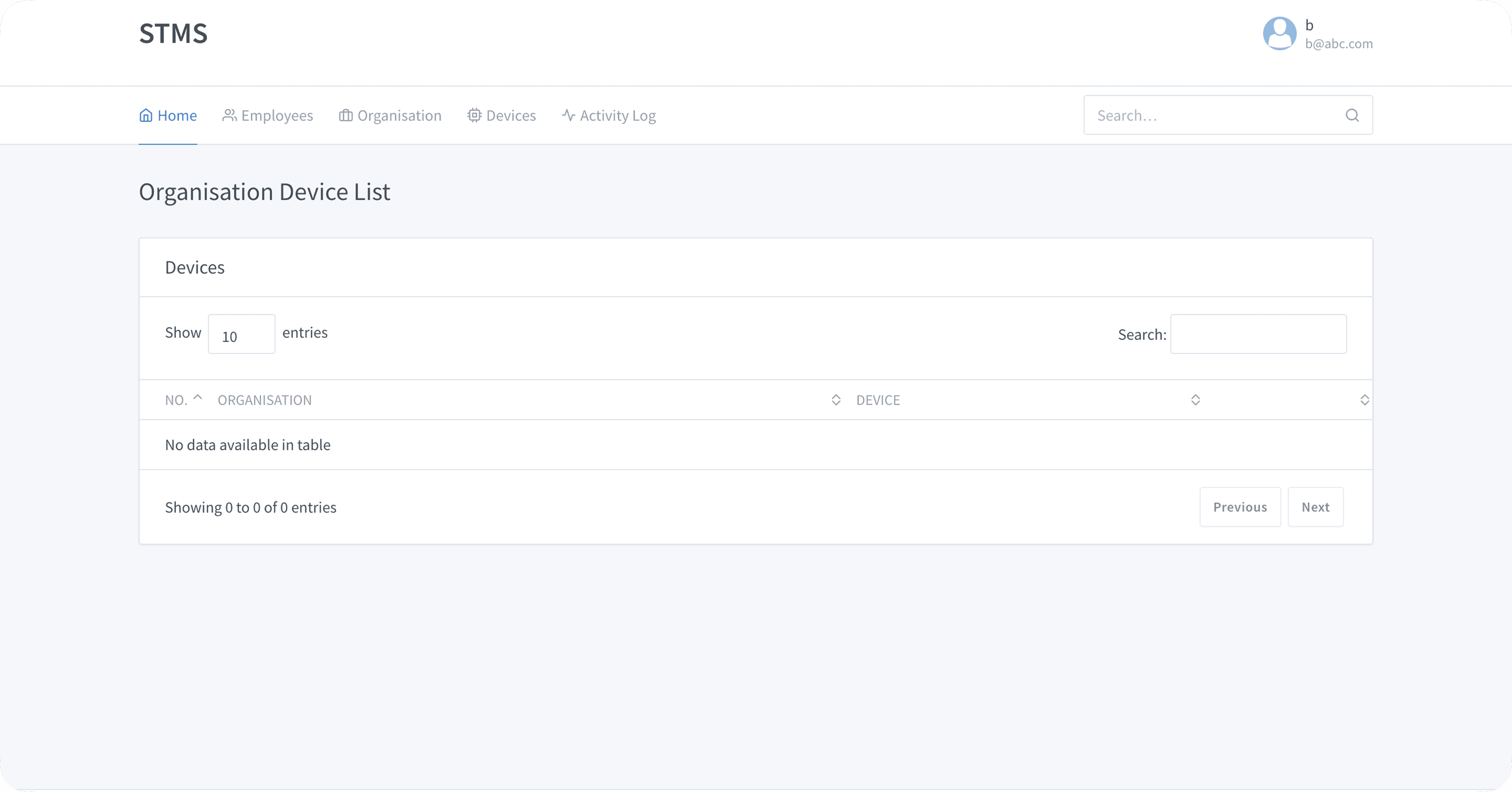
This was a redesign of an existing product, so I started by auditing the existing system thoroughly before generating any new ideas. Understanding what the current interface was trying to do was essential before deciding what to change.
- Full heuristic evaluation of the existing system — cataloguing usability violations and missed affordances
- Competitive analysis of established traffic management dashboards for reference patterns
- Worked closely with the product team to understand the functional requirements and operator mental models
- Designed for city officials and authorized organizations as the primary users — not general consumers
This was a redesign of an existing product, so I started by auditing the existing system thoroughly before generating any new ideas. Understanding what the current interface was trying to do was essential before deciding what to change.
- Full heuristic evaluation of the existing system — cataloguing usability violations and missed affordances
- Competitive analysis of established traffic management dashboards for reference patterns
- Worked closely with the product team to understand the functional requirements and operator mental models
- Designed for city officials and authorized organizations as the primary users — not general consumers
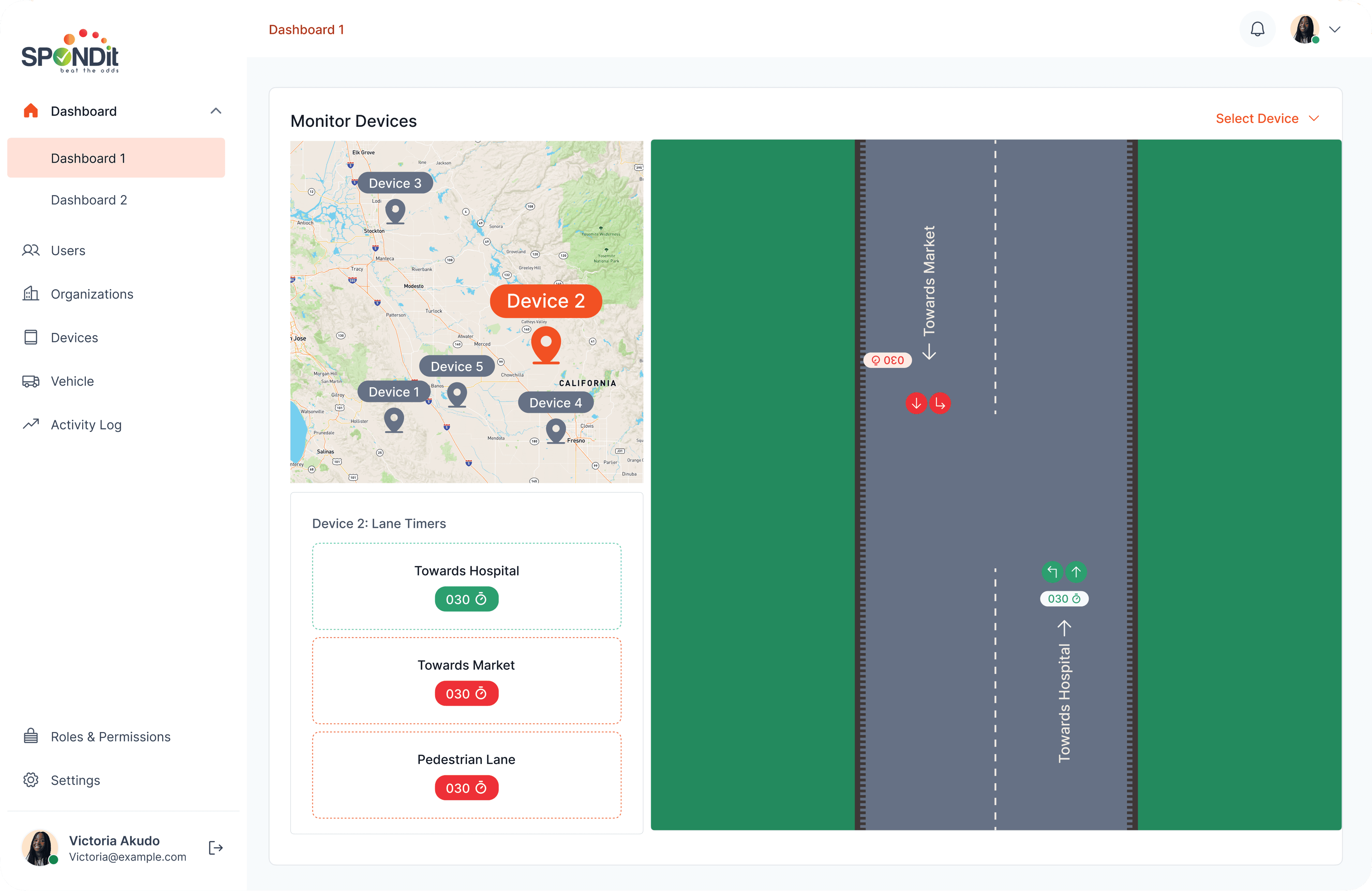
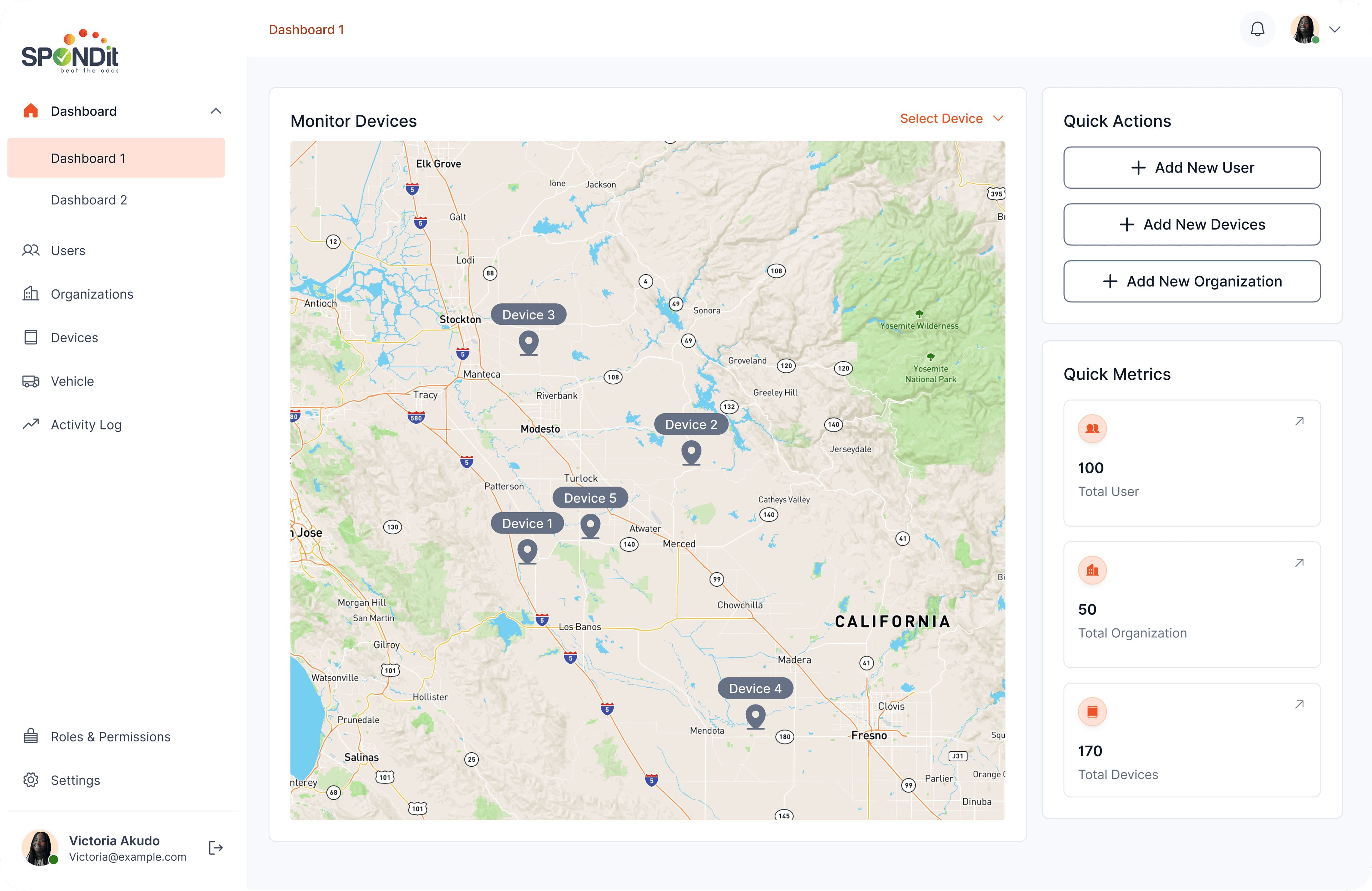
Map-first dashboard.
Operators now open the product into a live view of the city — every connected device visible, and every status legible at a glance.
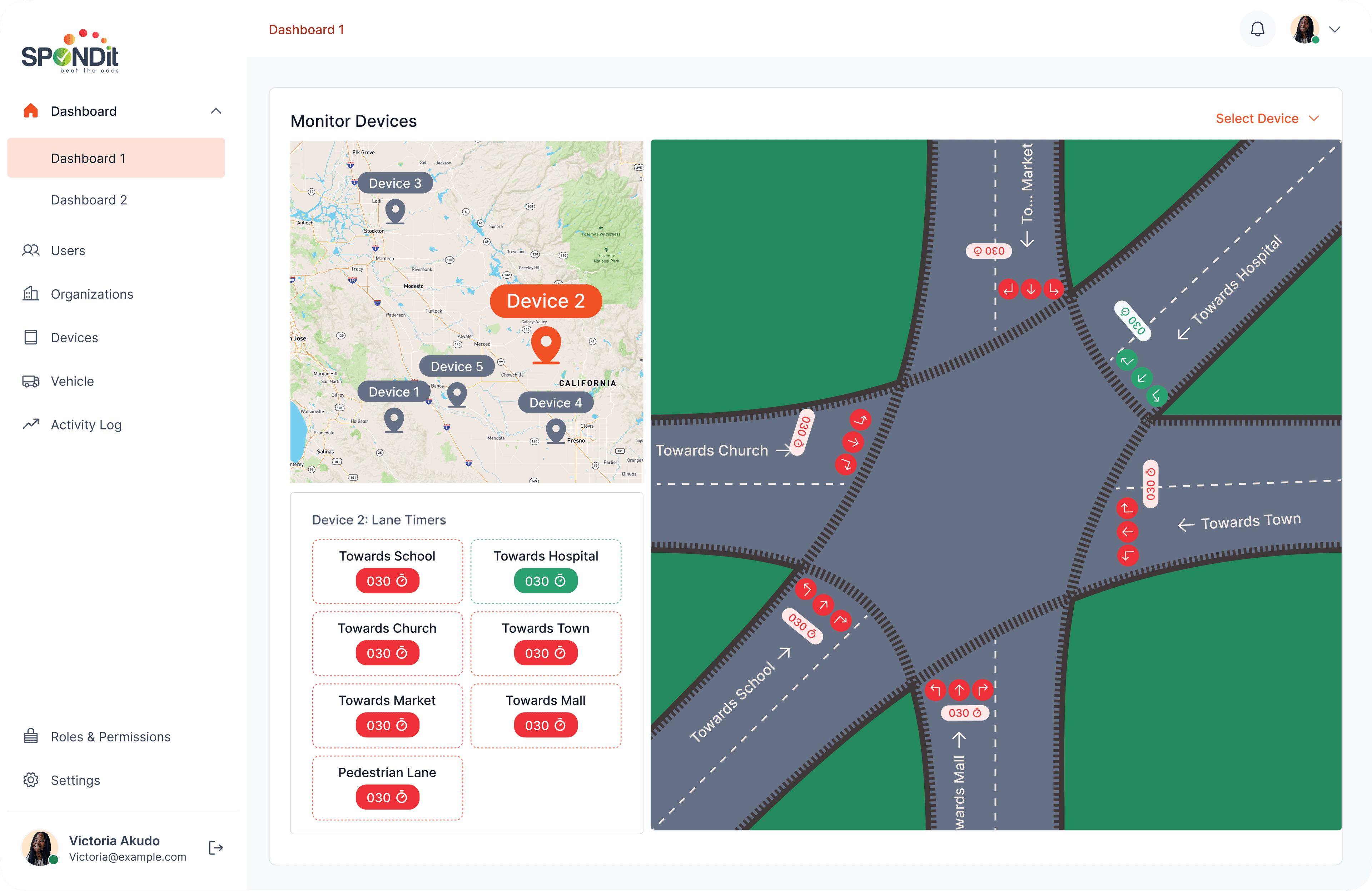
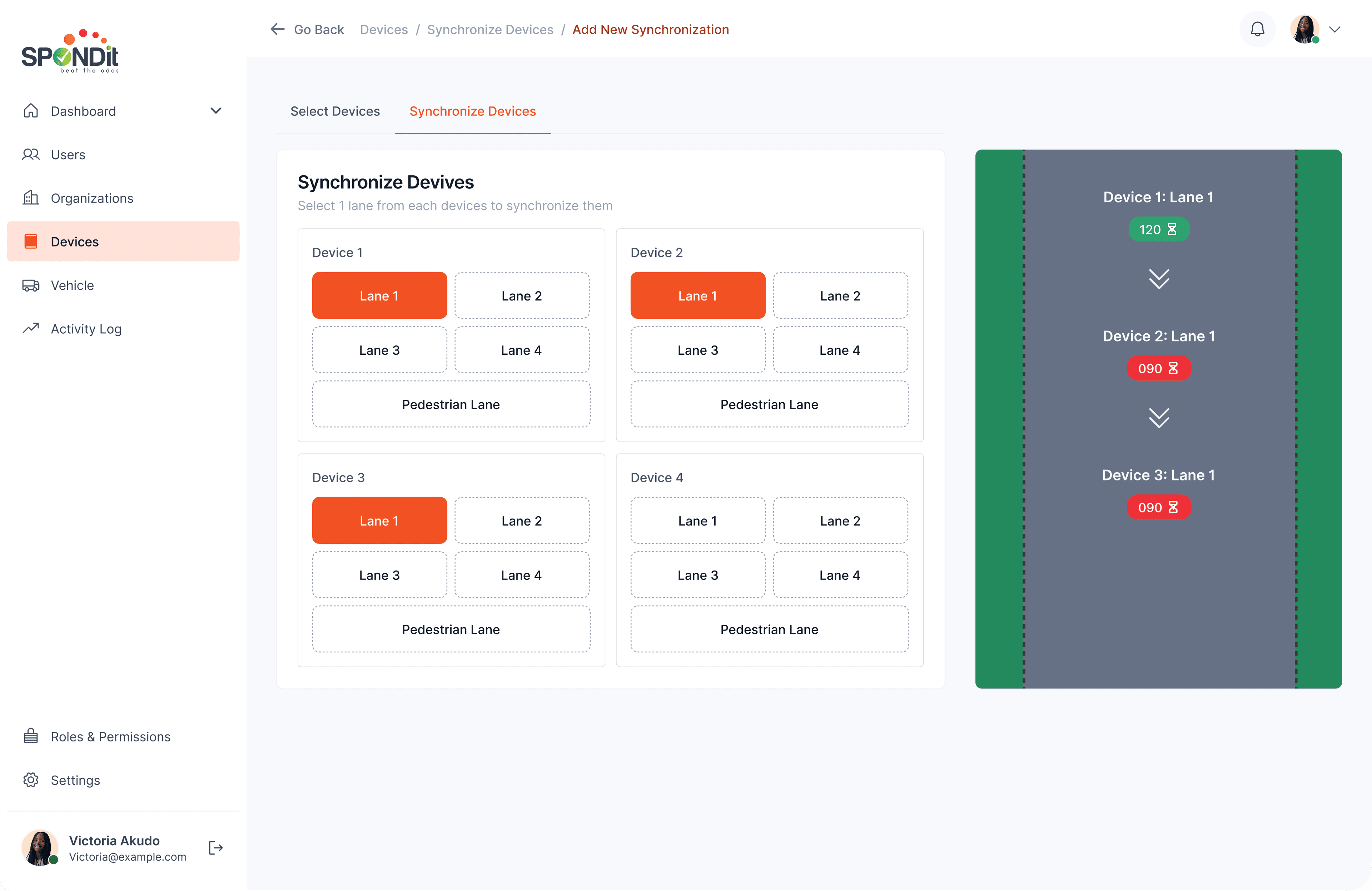
Intersection view.
A spatial visualization of each intersection's lanes, color-coded by flow state. Operators see at a glance which lanes are open and which are blocked, before zooming in to act on it.
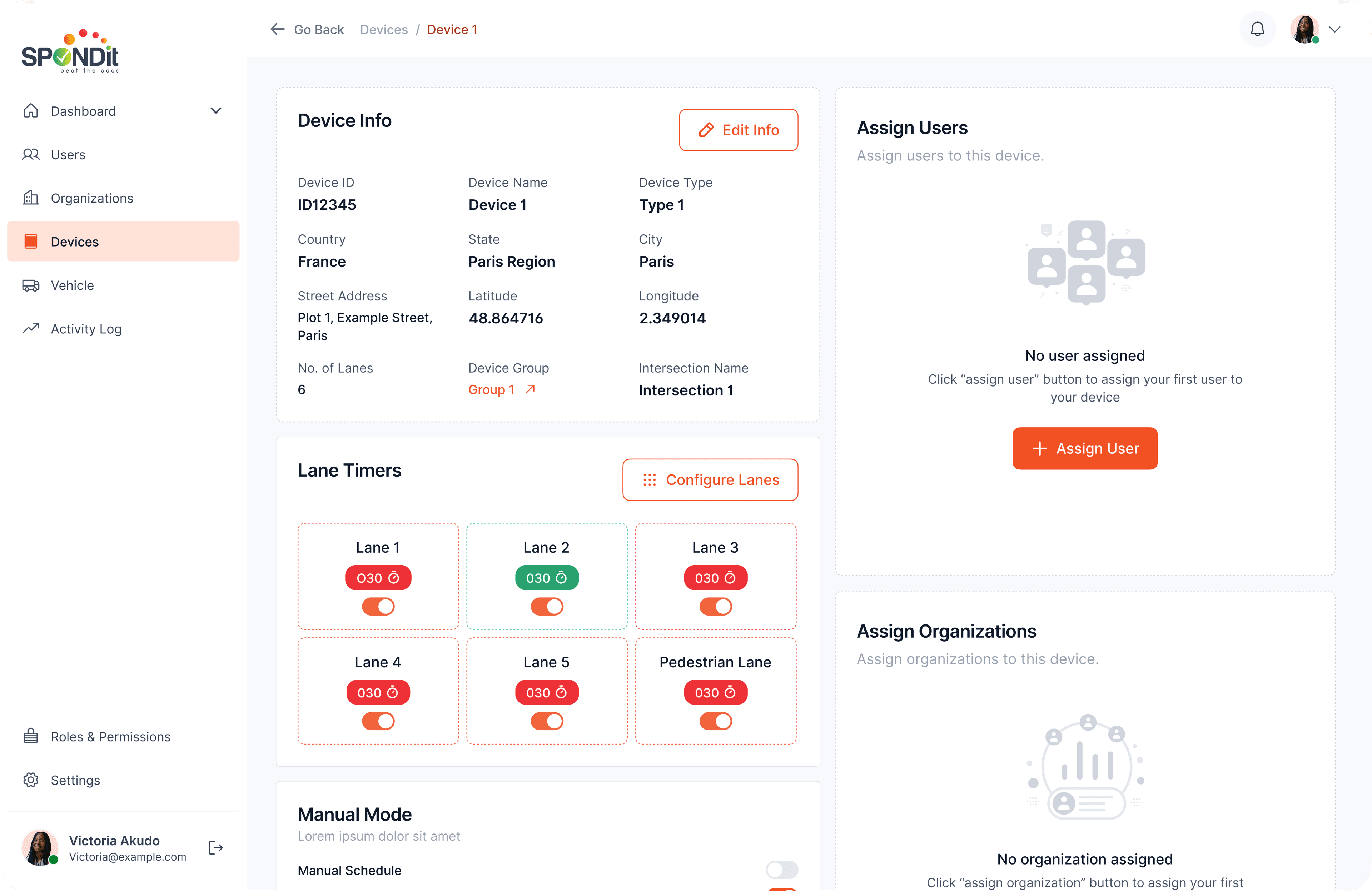
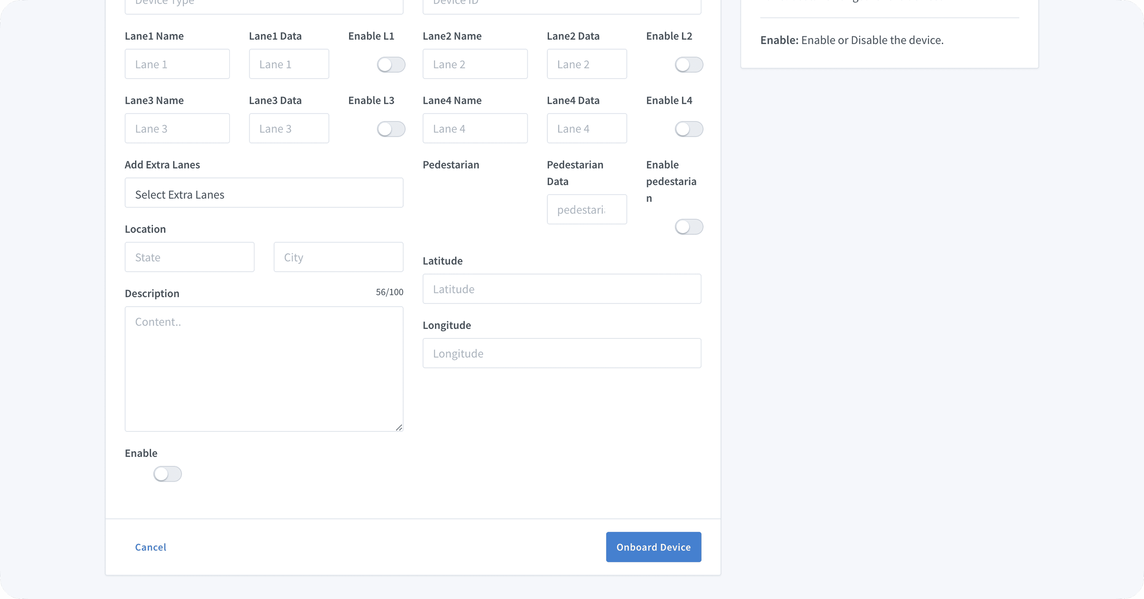
Device control surface.
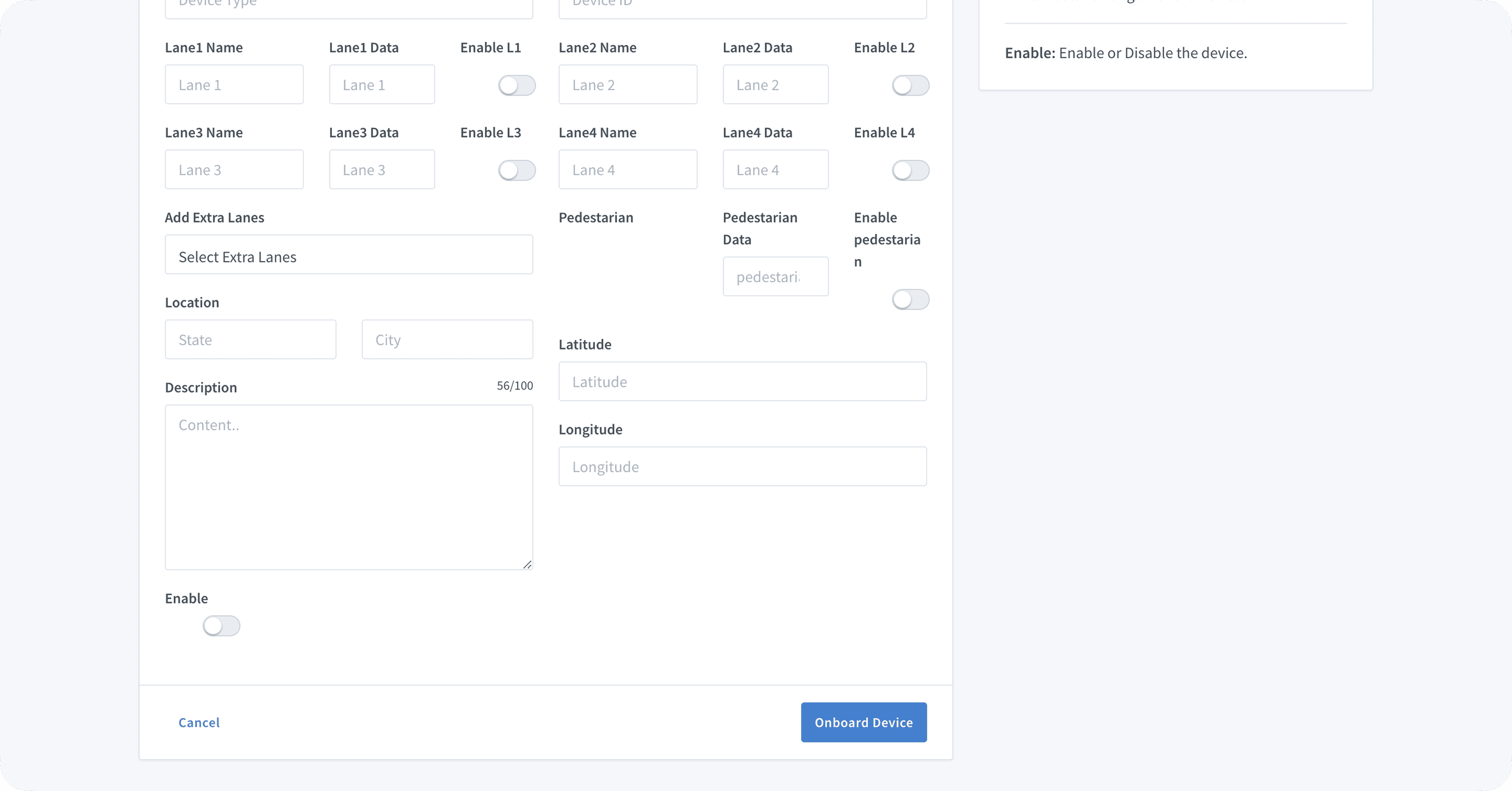
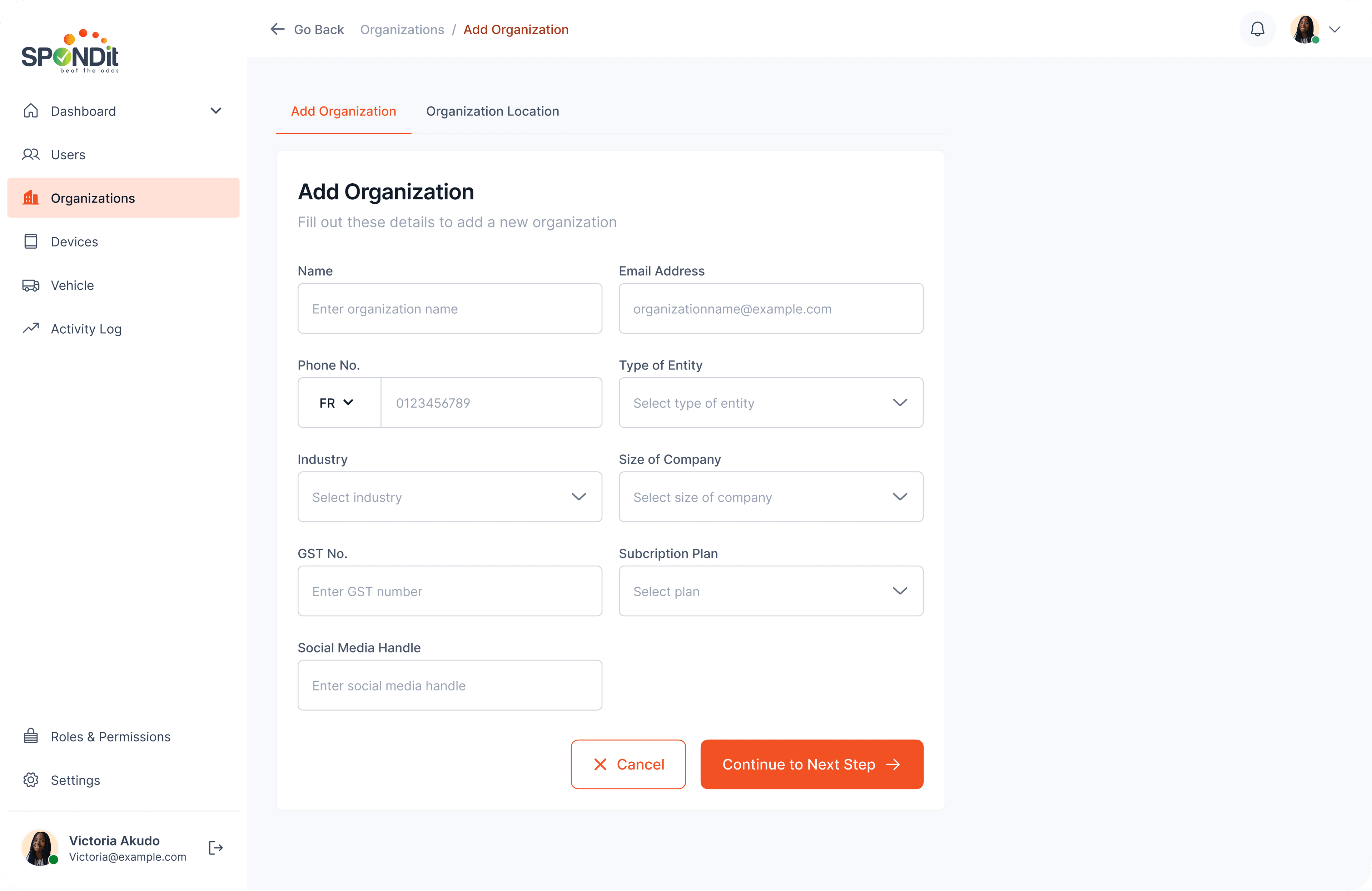
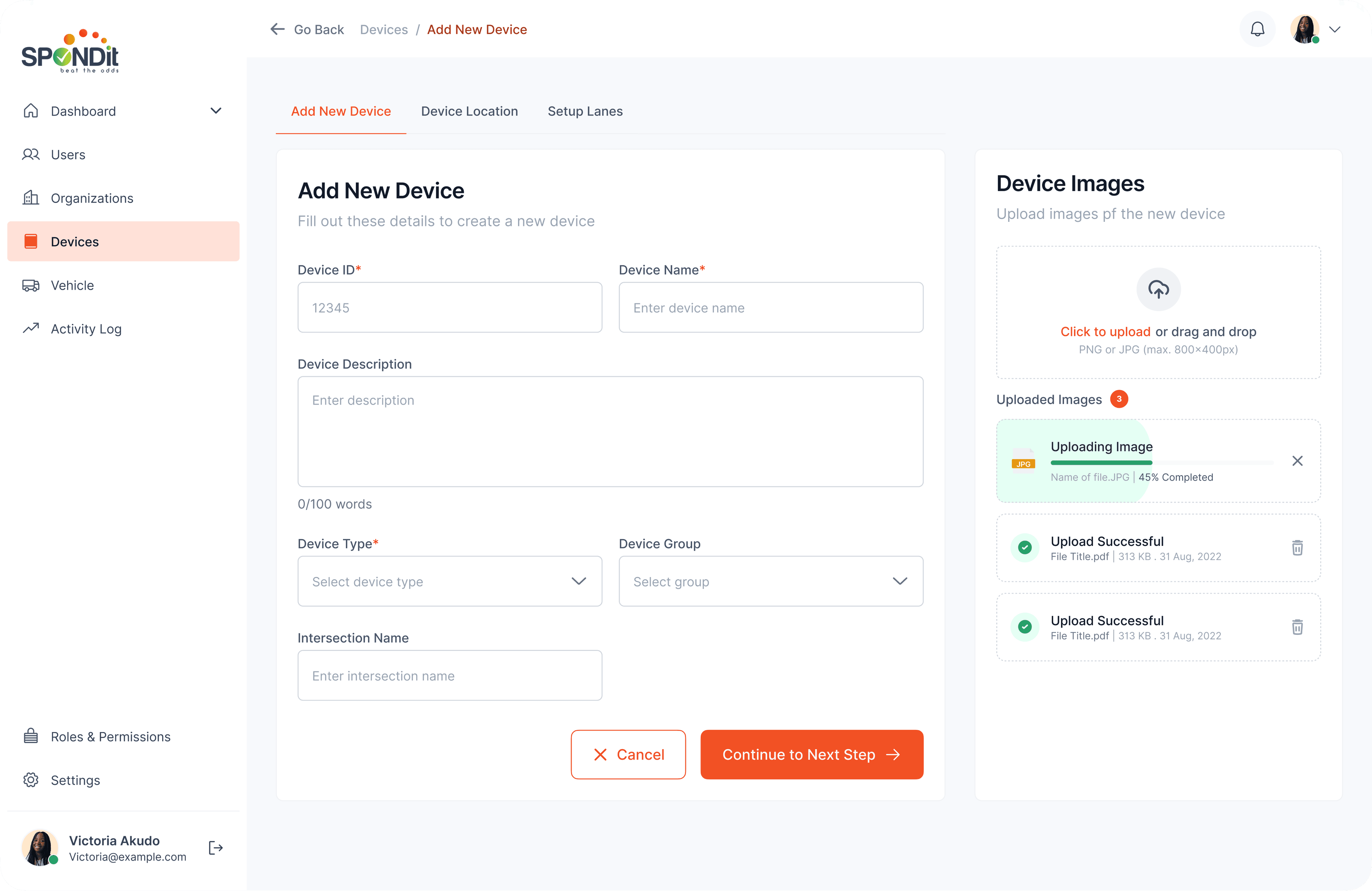
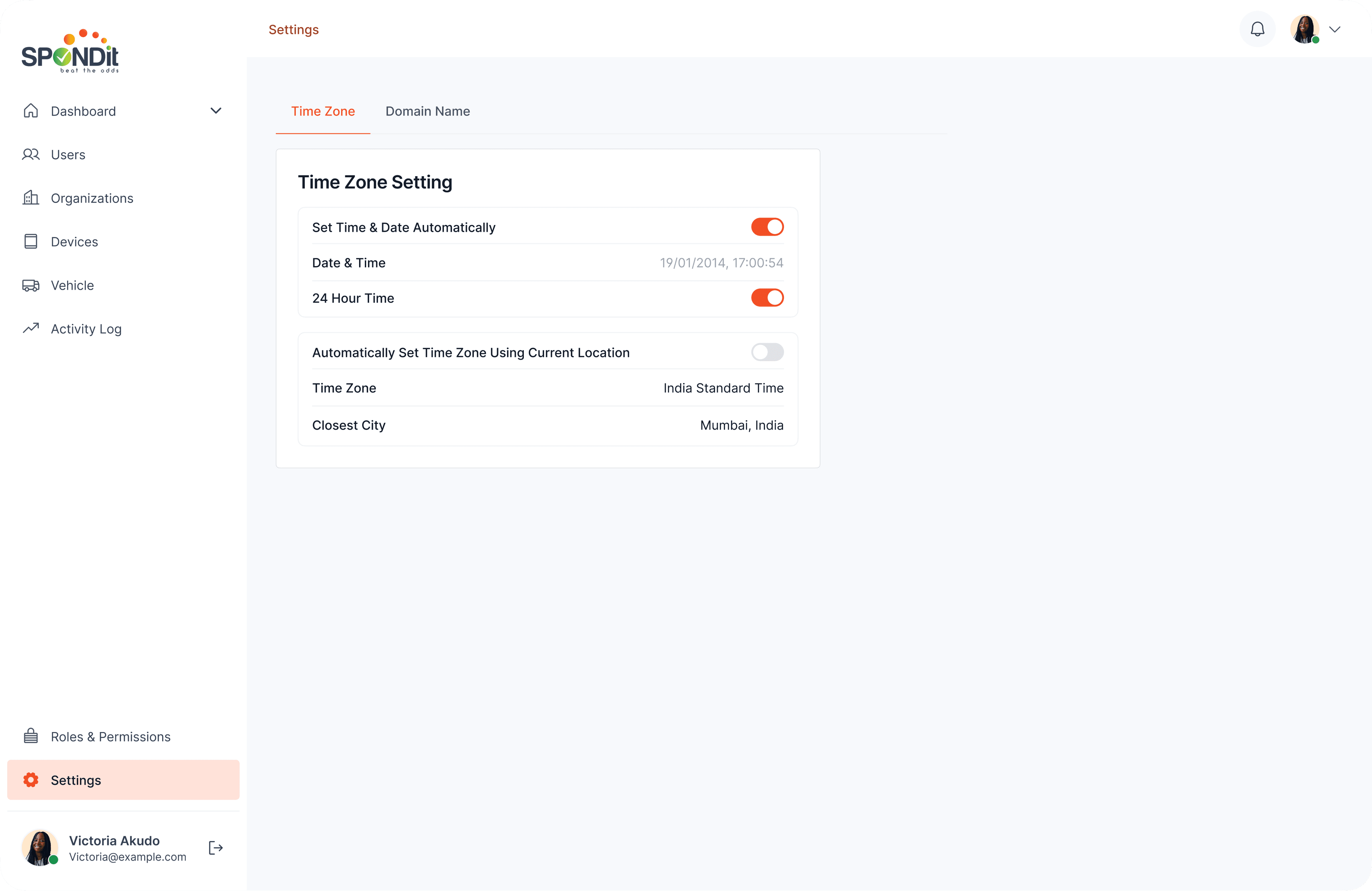
Per-device pages expose what operators actually need: device info, lane-by-lane timers, override modes (manual or automated), day-of-week schedules, location, lane configuration. A device-onboarding flow handles new hardware end-to-end.
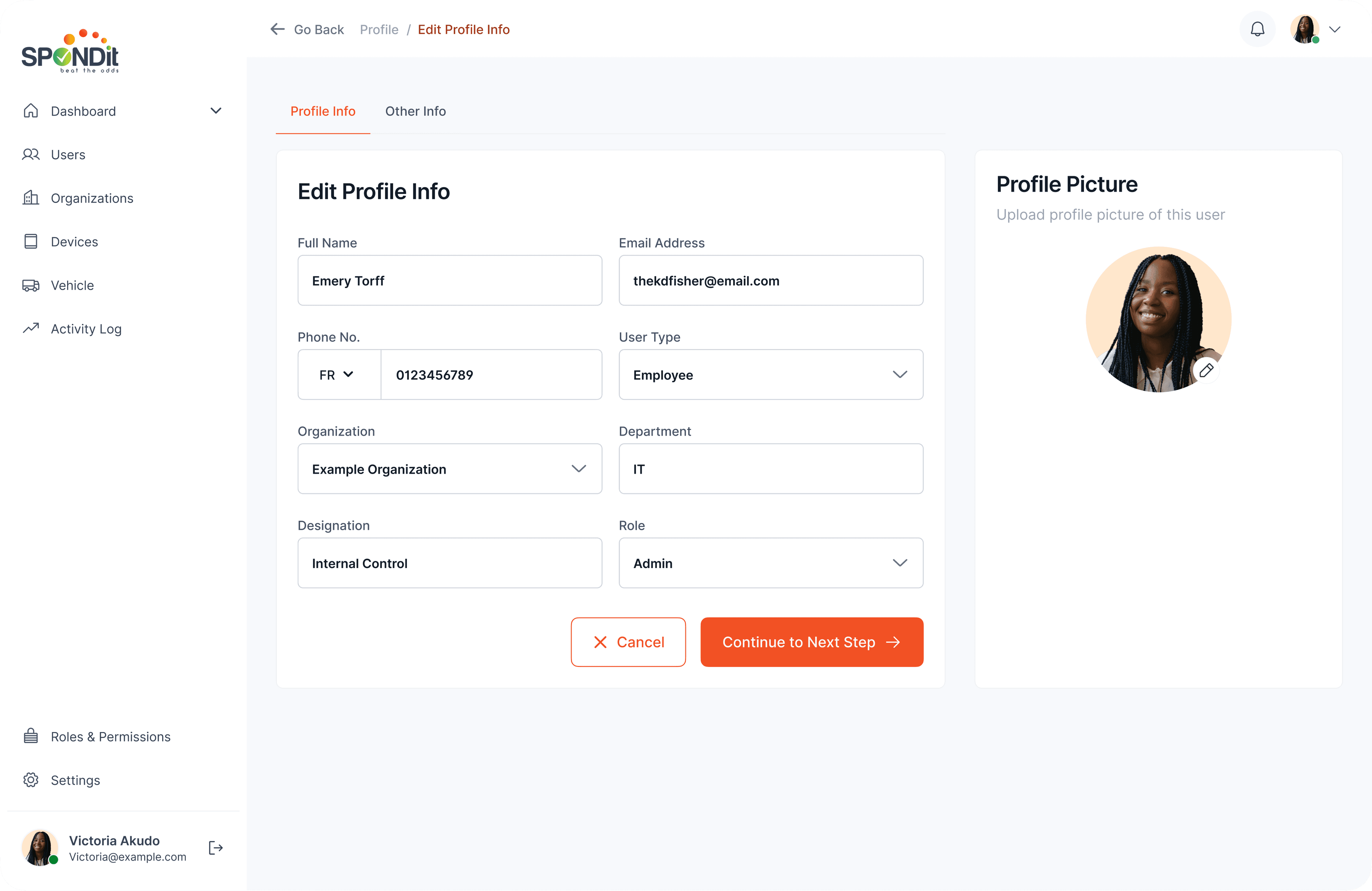
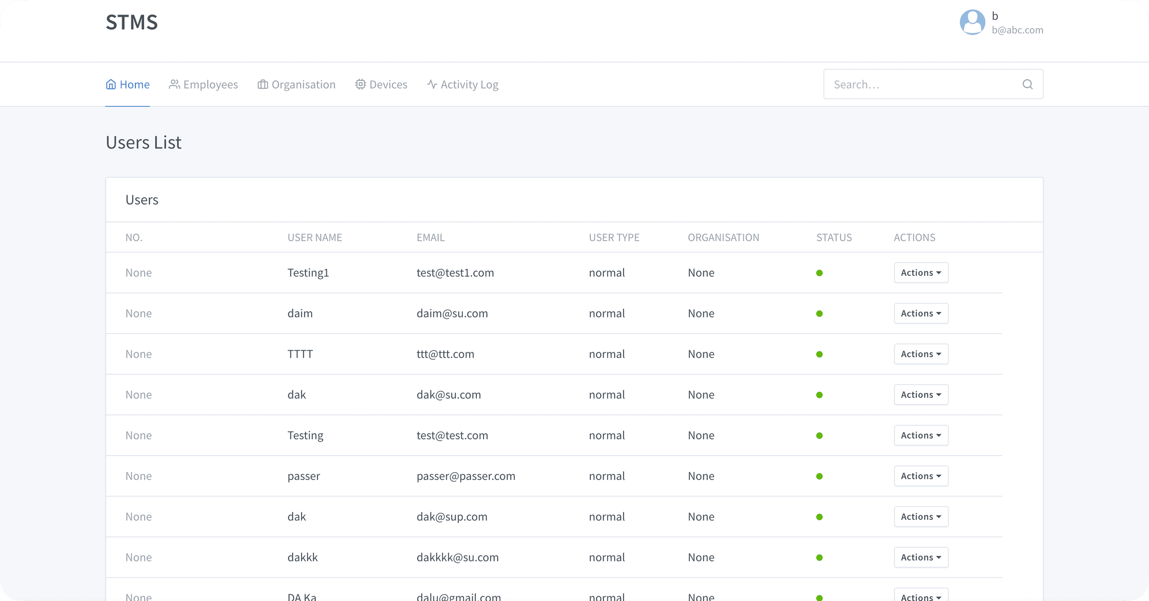
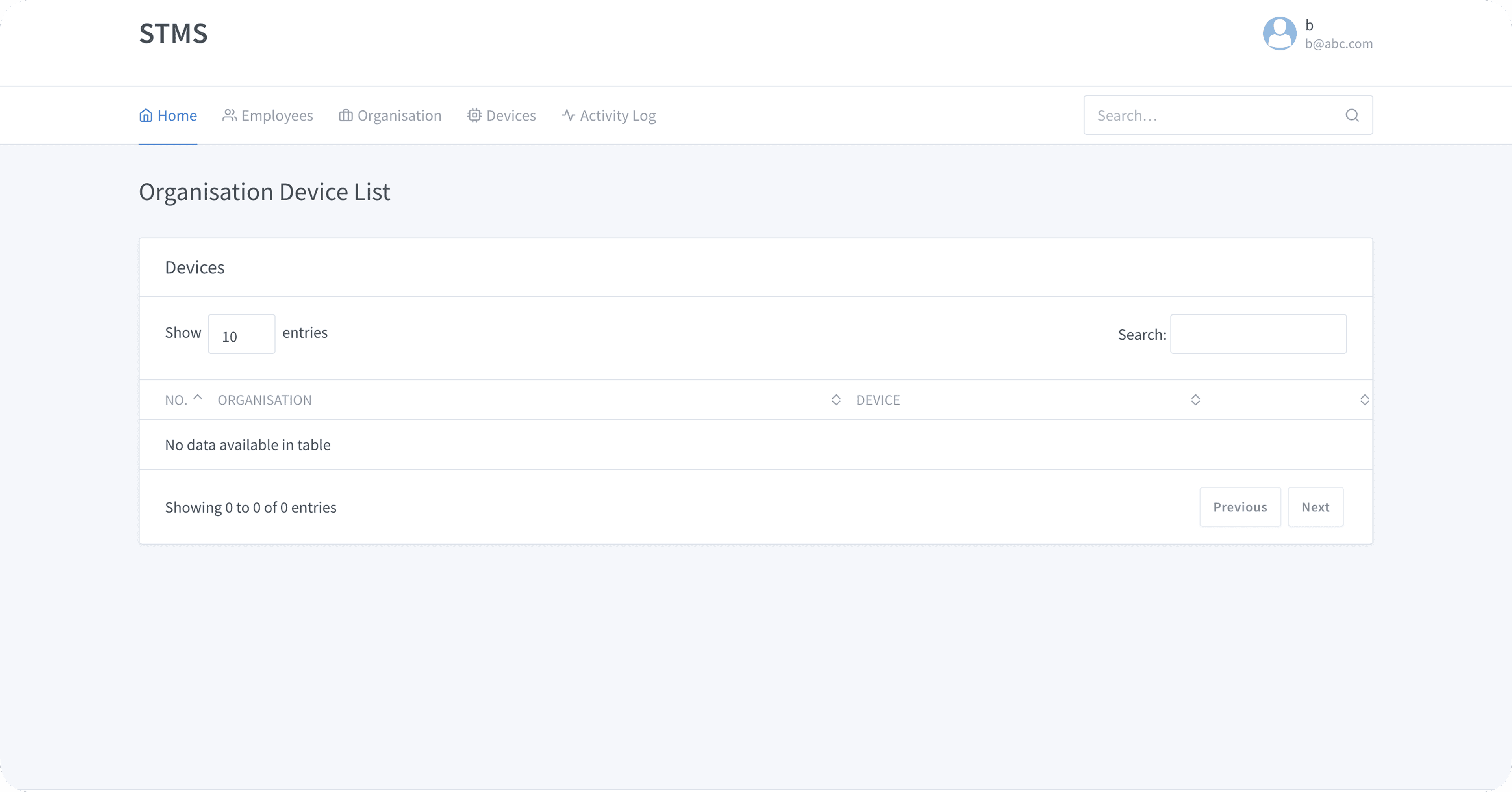
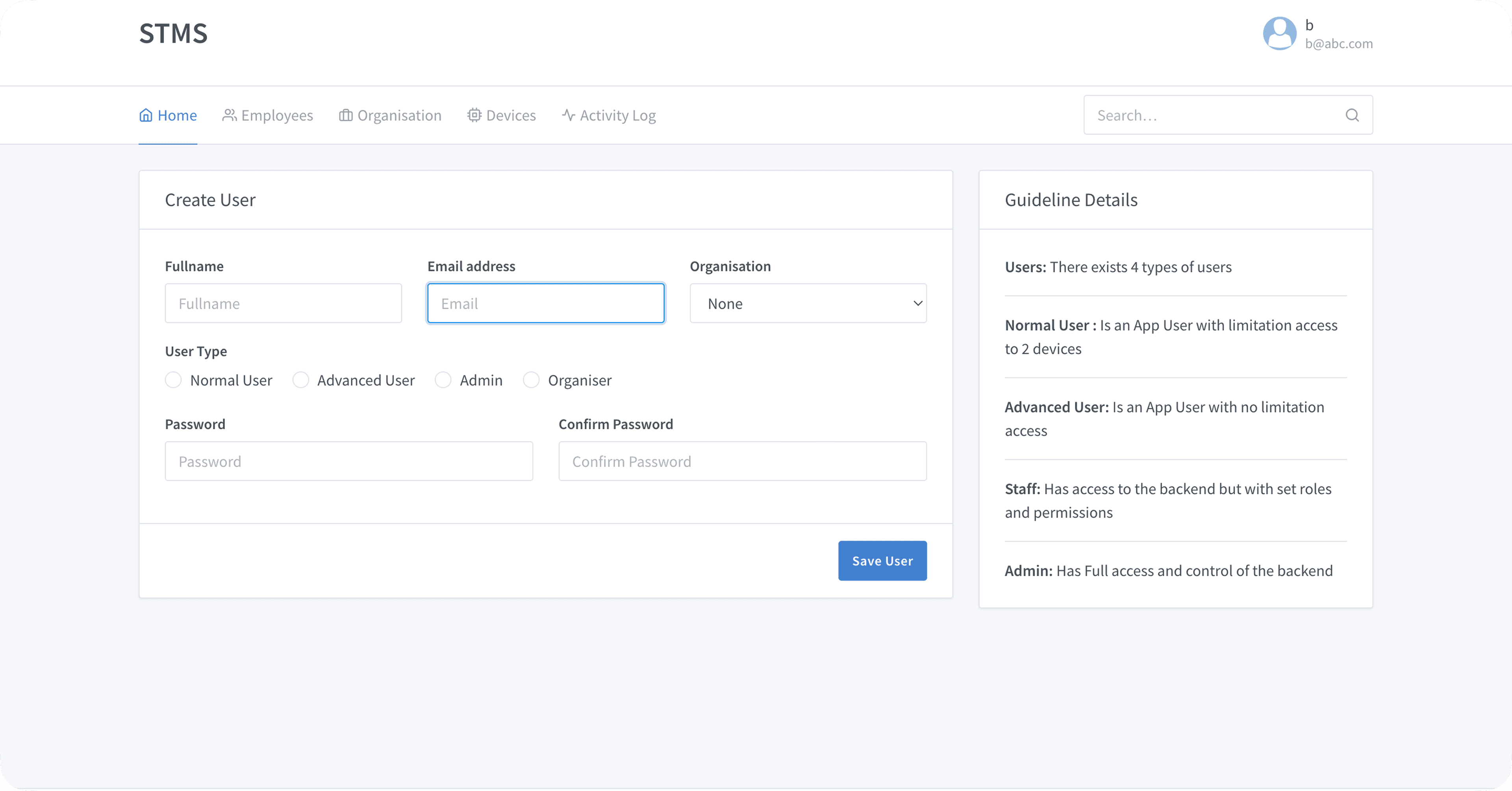
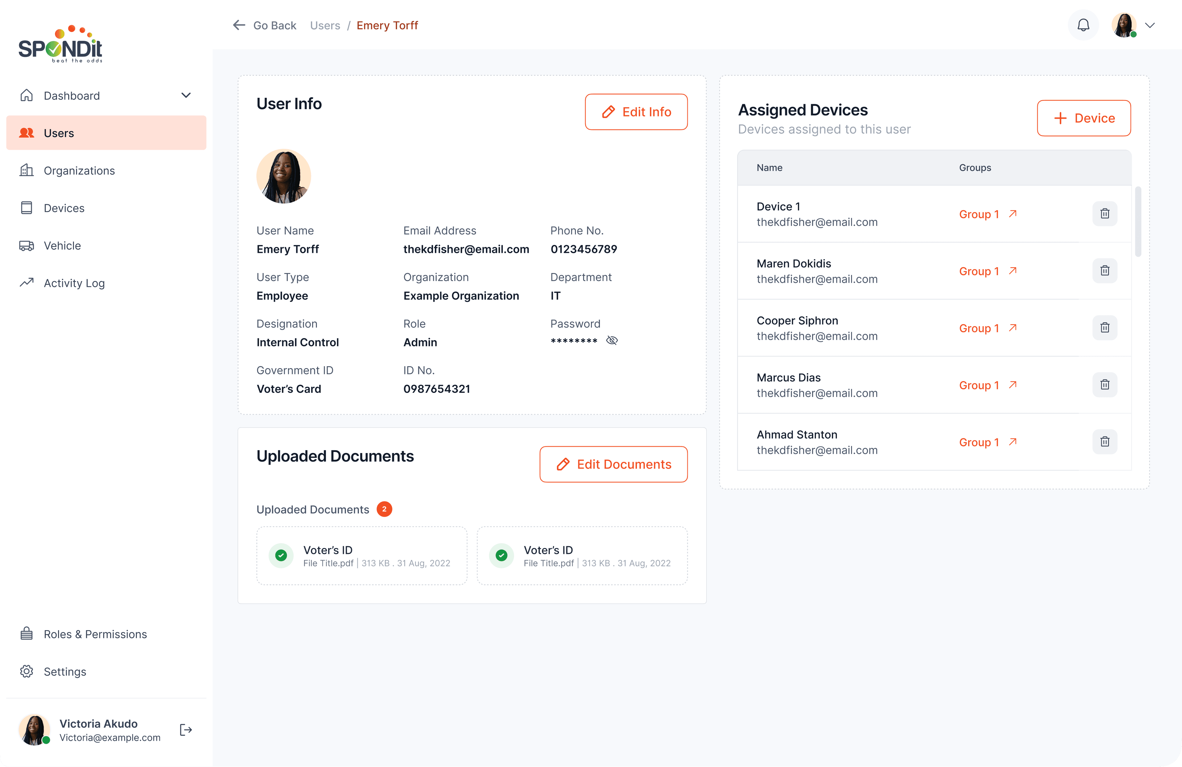
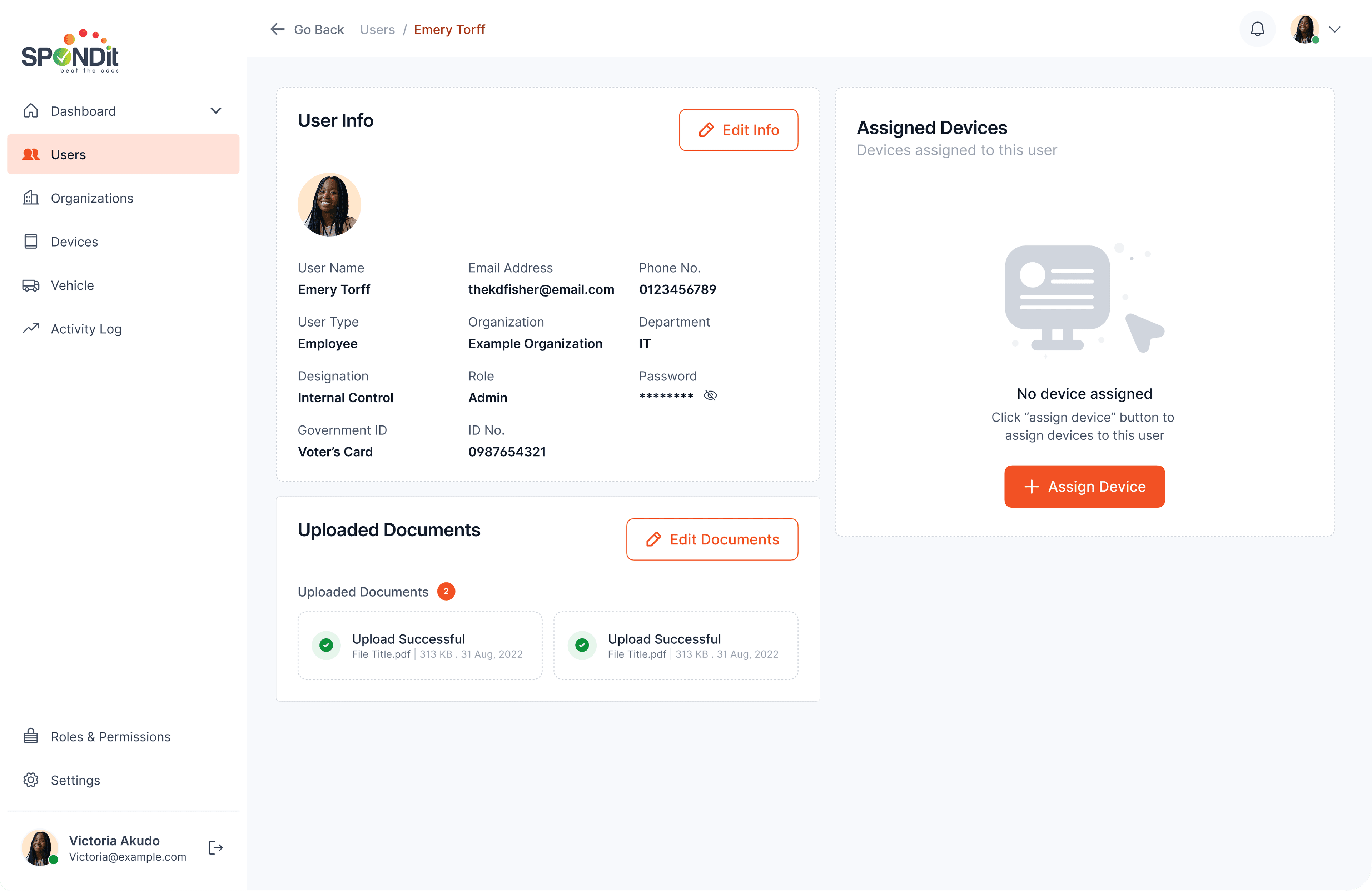
Multi-tenant management.
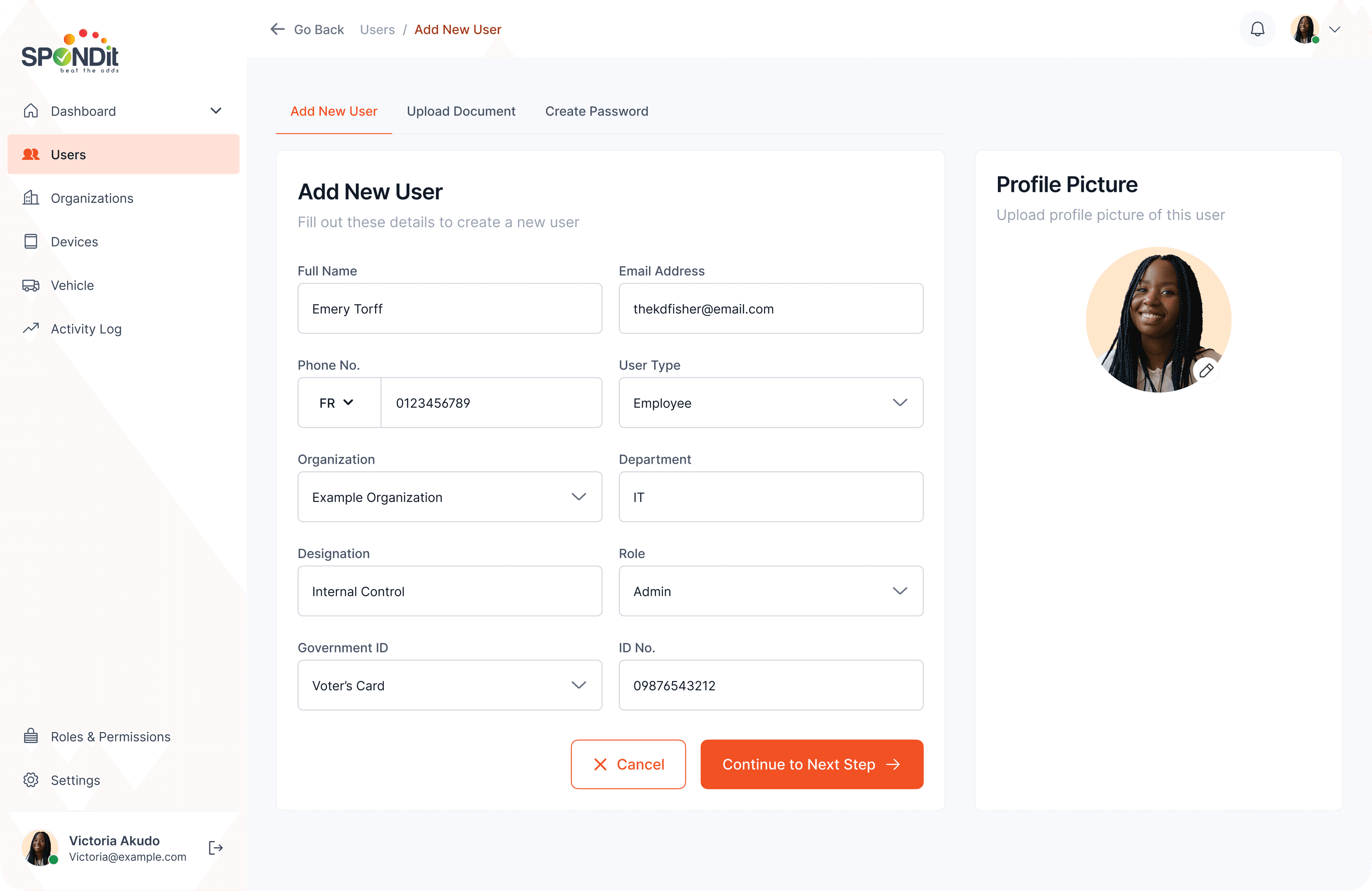
Organizations, users, devices, and roles are managed better. Operators can assign any device to any user or organization with the right permissions; an explicit roles screen maps to the hierarchy (Super Admin, Admin, Manager, City Admin, Technician).
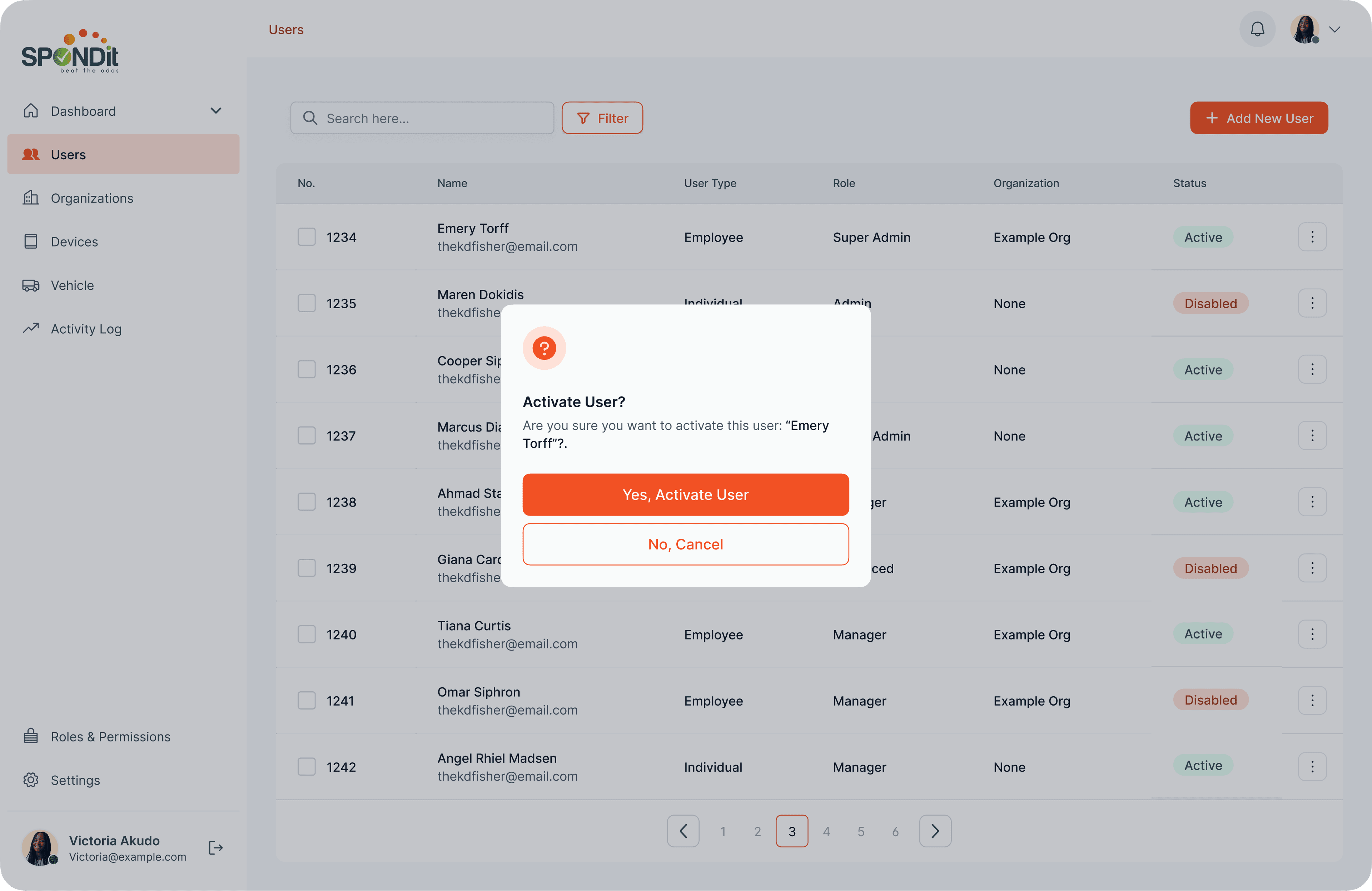
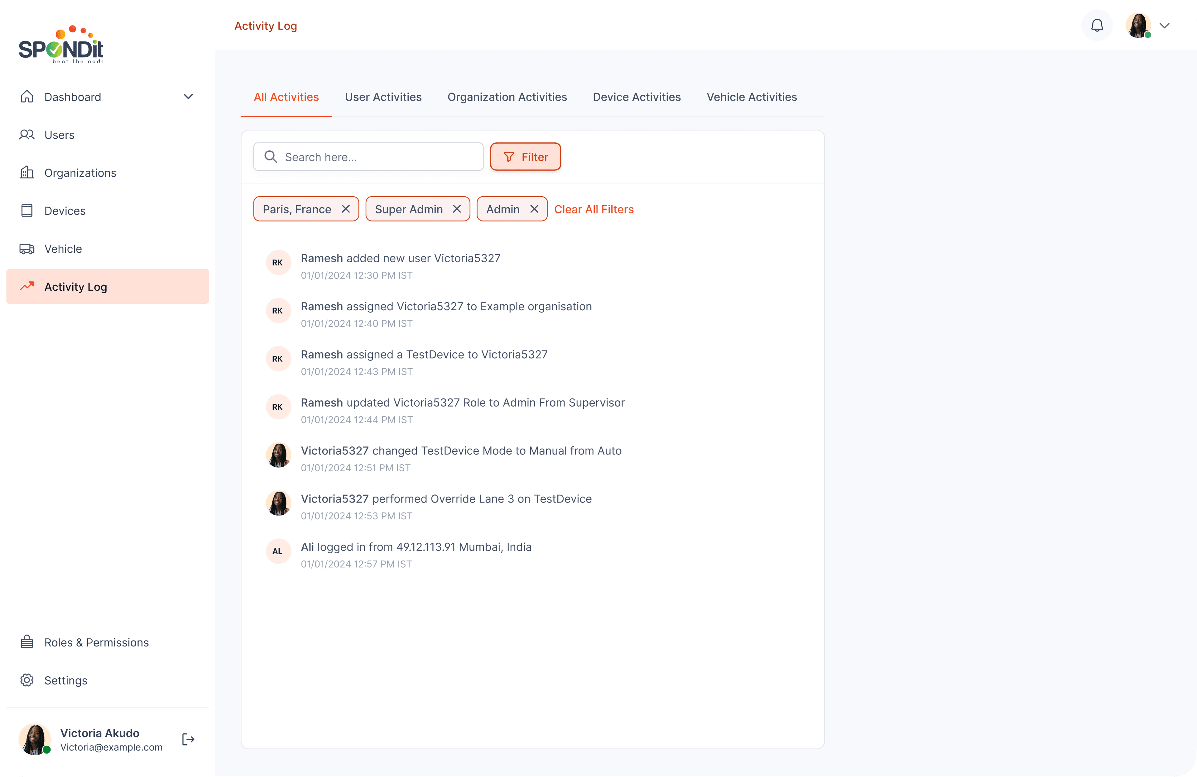
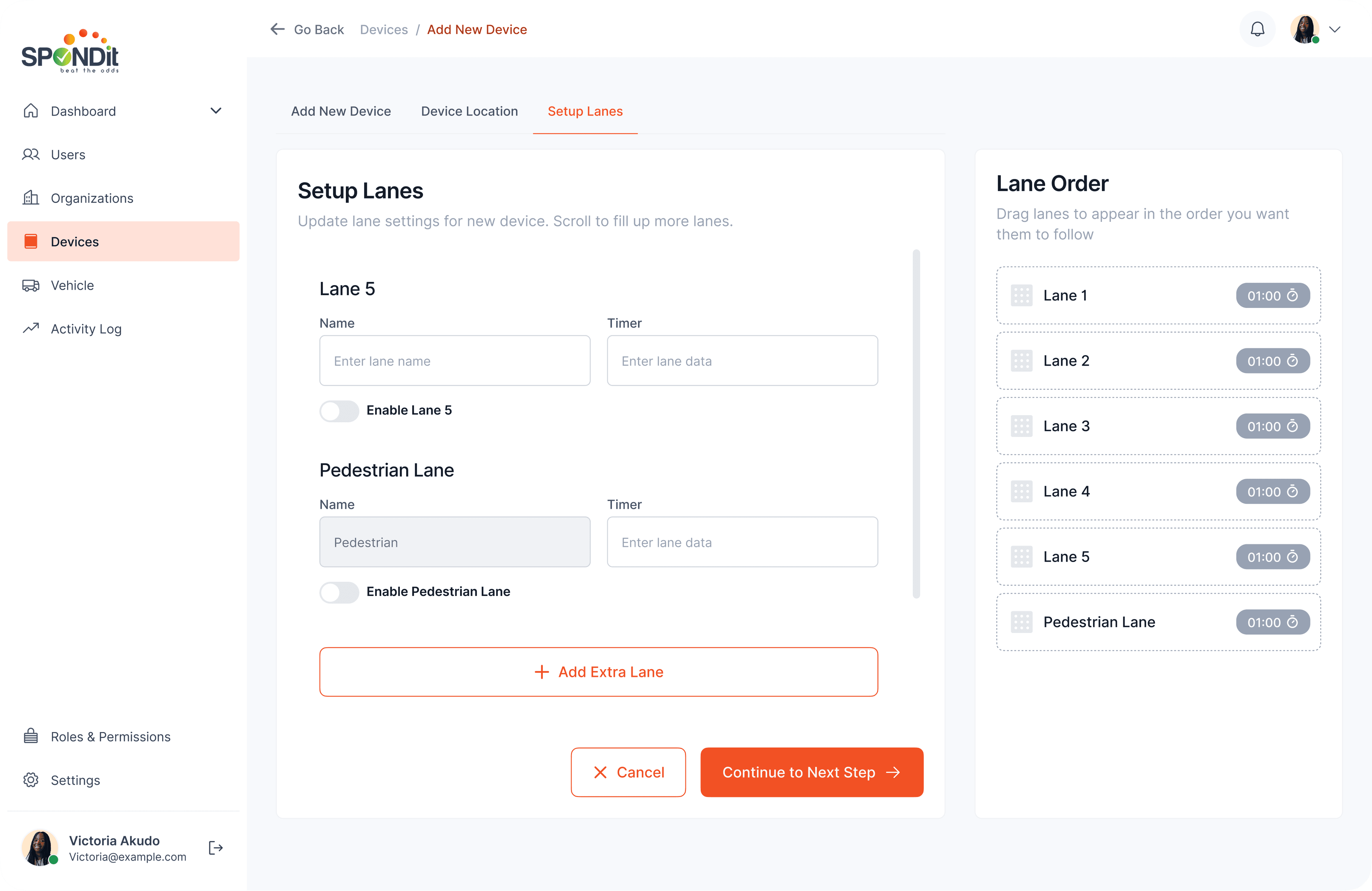
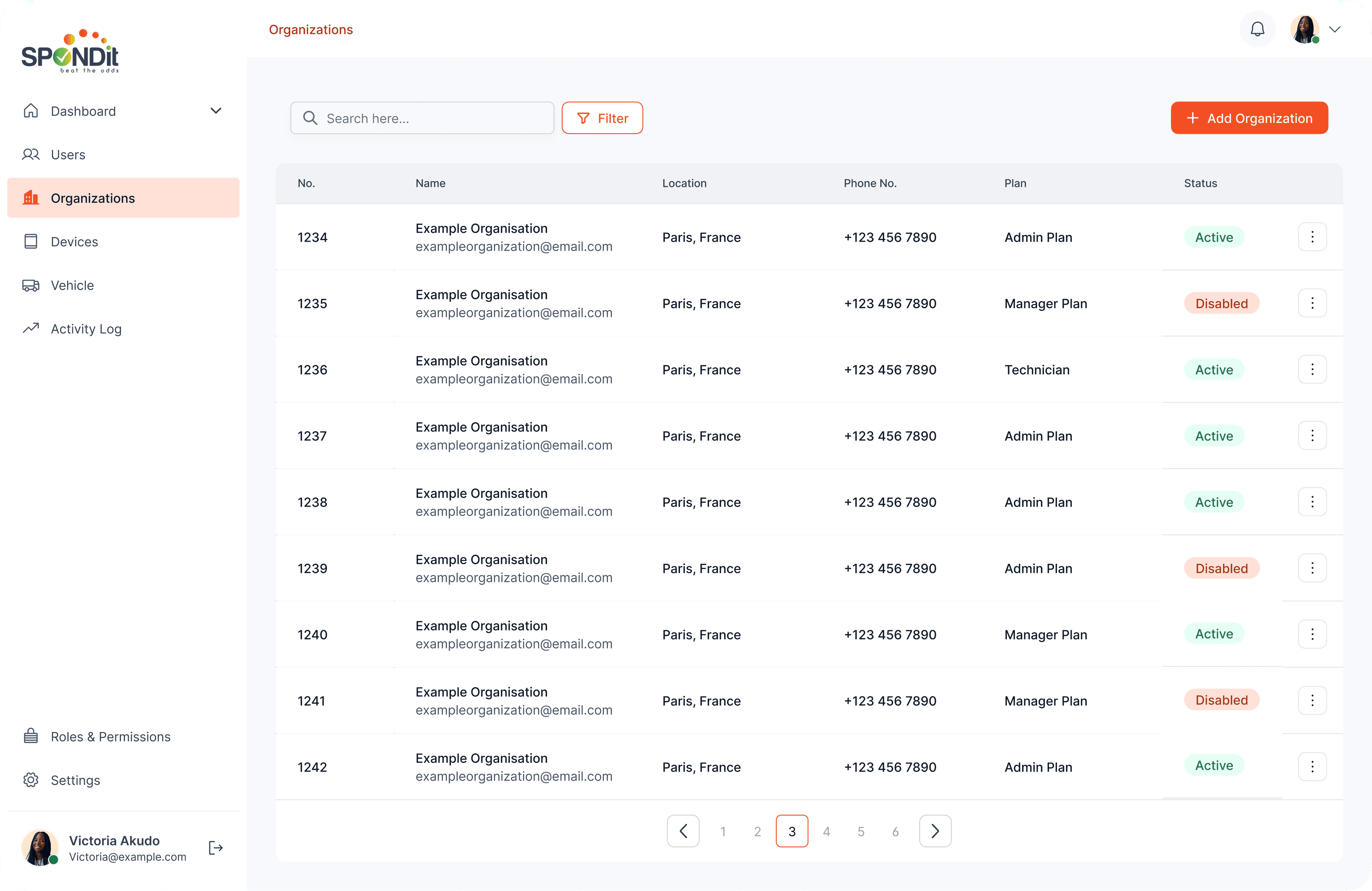
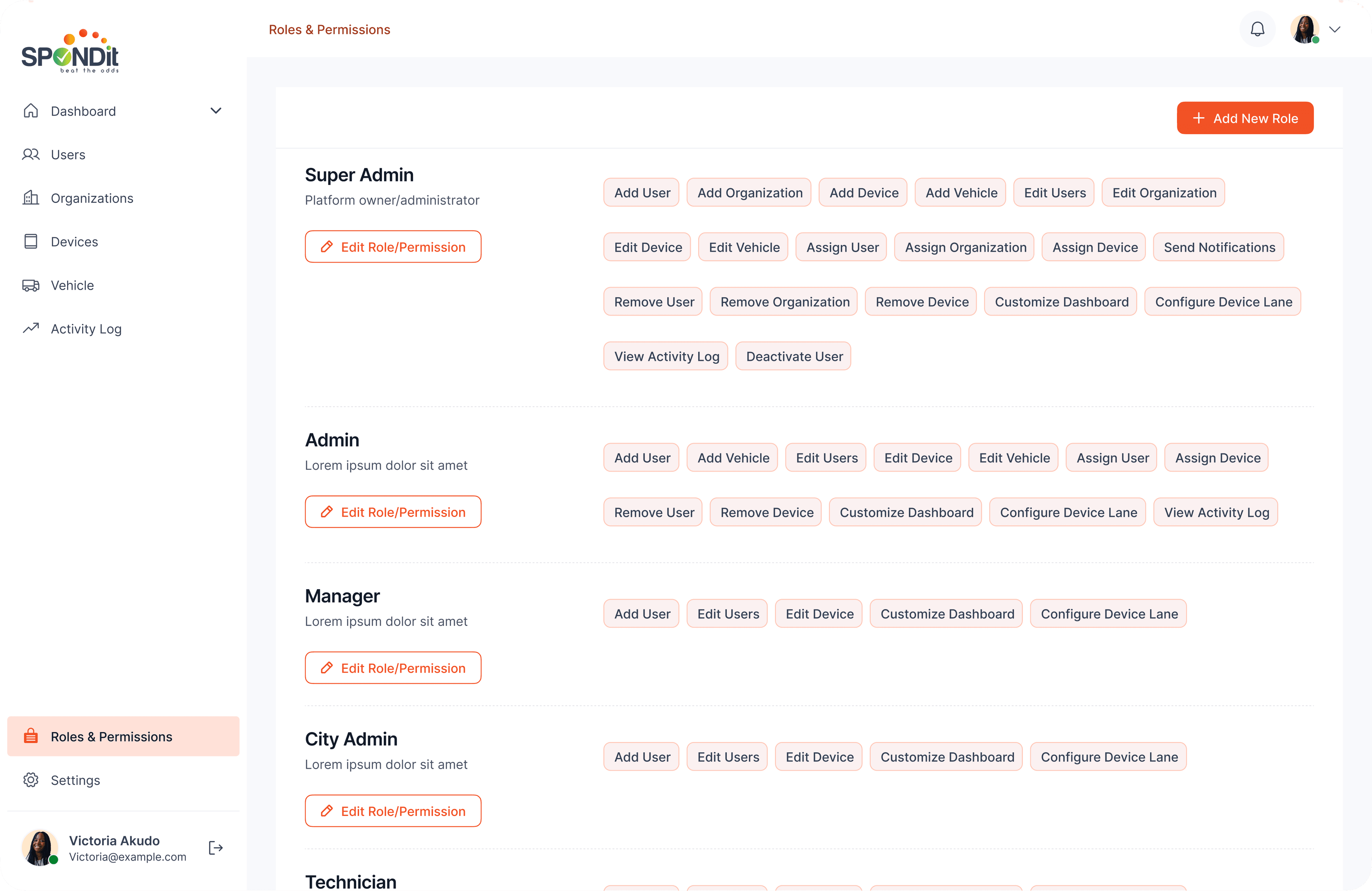
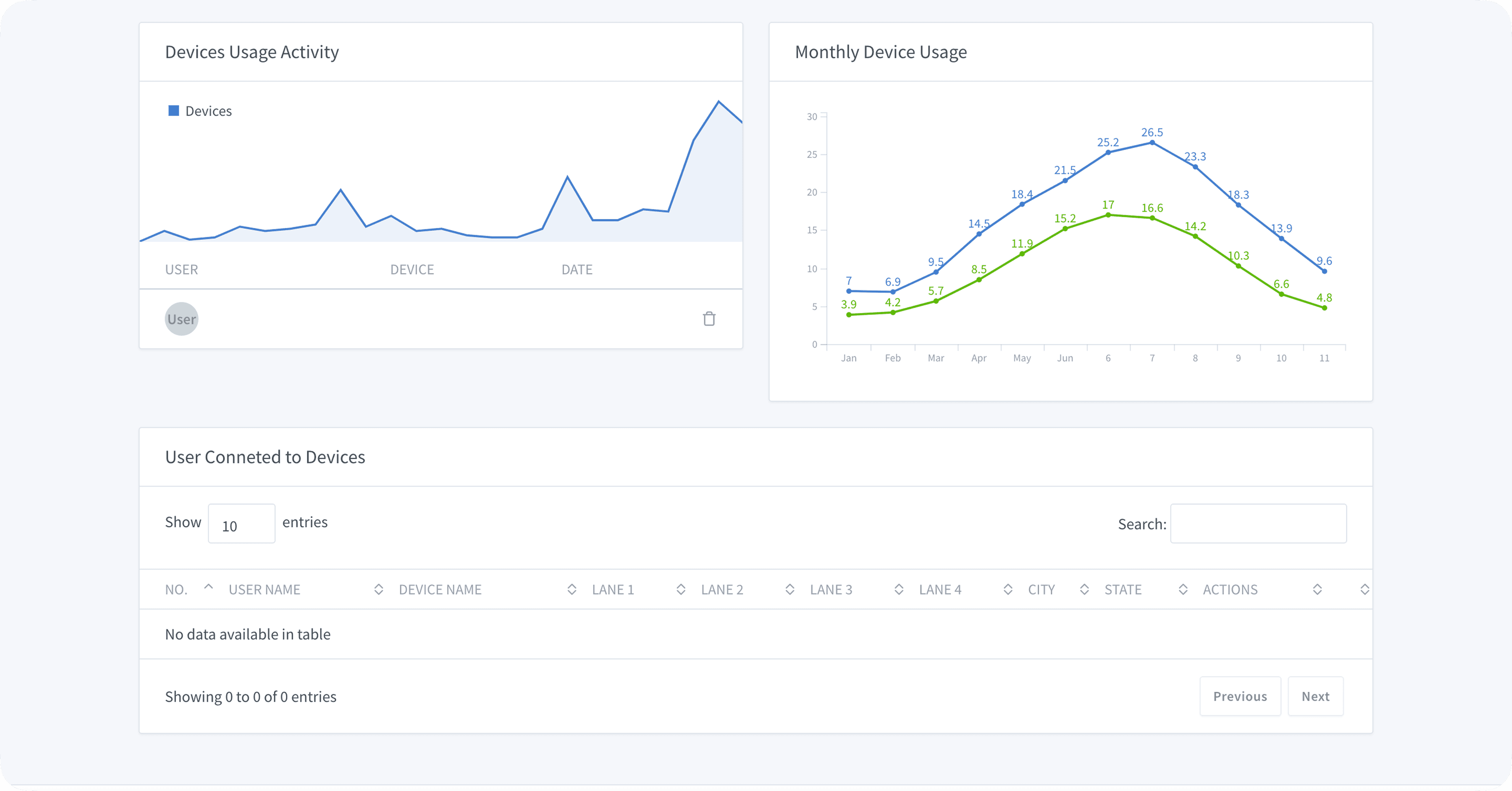
The redesigned interface improved usability significantly for city officials and positioned Spondit as a credible solution for organisations looking to modernise their traffic management infrastructure.
- Transformed an outdated, inaccessible system into a clean, operator-focused command interface
- Improved visual hierarchy enabled faster scanning and decision-making
- Interface design increased confidence and adoption among target stakeholders
Enterprise and SaaS designs require a different discipline than consumer products. You're not designing for delight — you're designing for trust and efficiency under pressure. This project reinforced that restraint is a design skill: the temptation to add visual interest had to be constantly balanced against the cost of cognitive load. For a user managing city traffic in real time, every unnecessary element on screen is a liability.
What Next?